Startup Grind

Startup Grind

Startup Grind

Client

Kendra Shellick

Kendra Shellick

Software used

Adobe Illustrator & Google Slides

Services

Problem Solving | Presentation & Layout Design | Custom Visual Elements | Brand Integration

Website

StartupGrind.com

StartupGrind.com

Problem & Goal

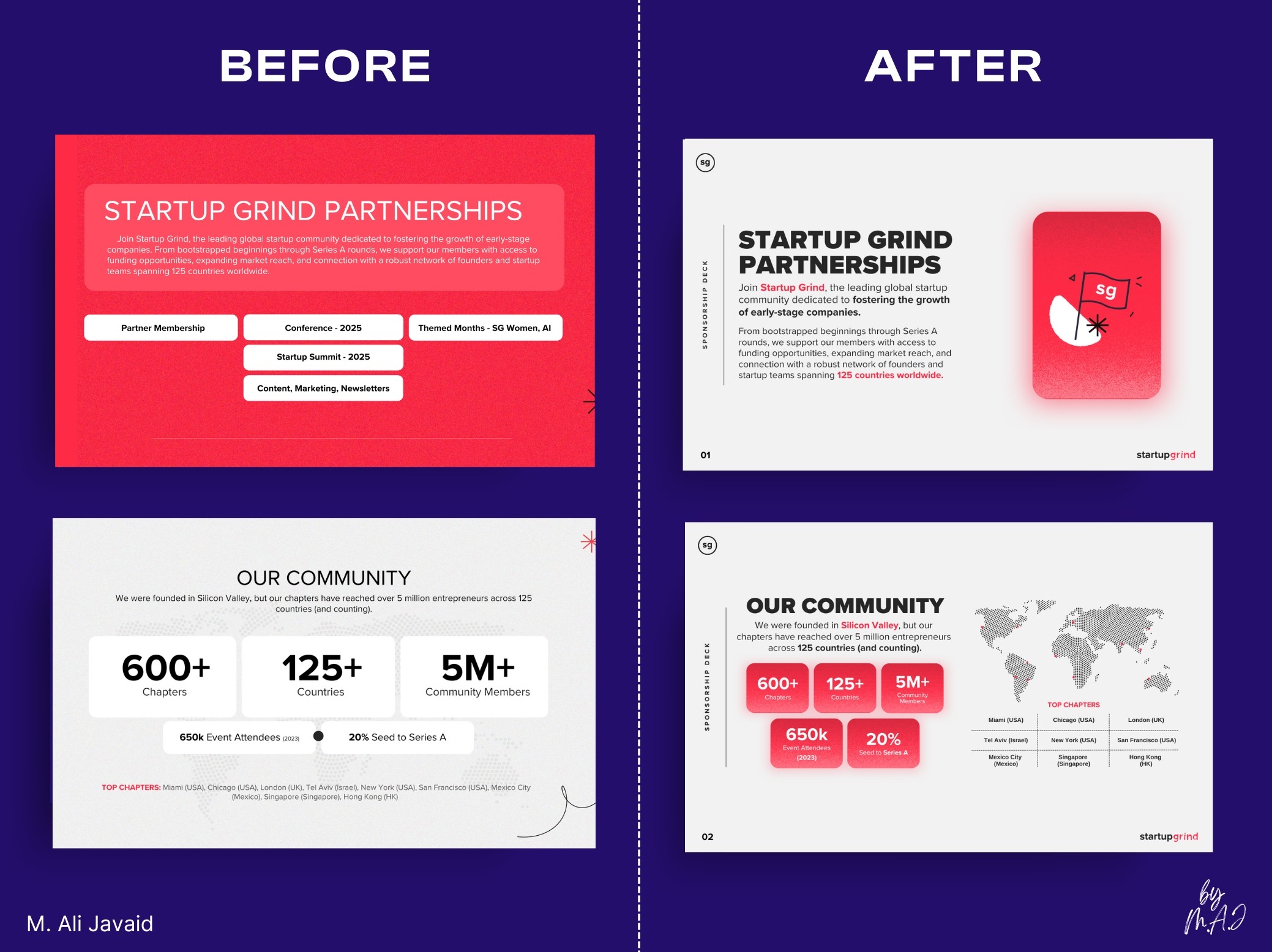
Merging two brand identities into one seamless presentation? Challenge accepted.

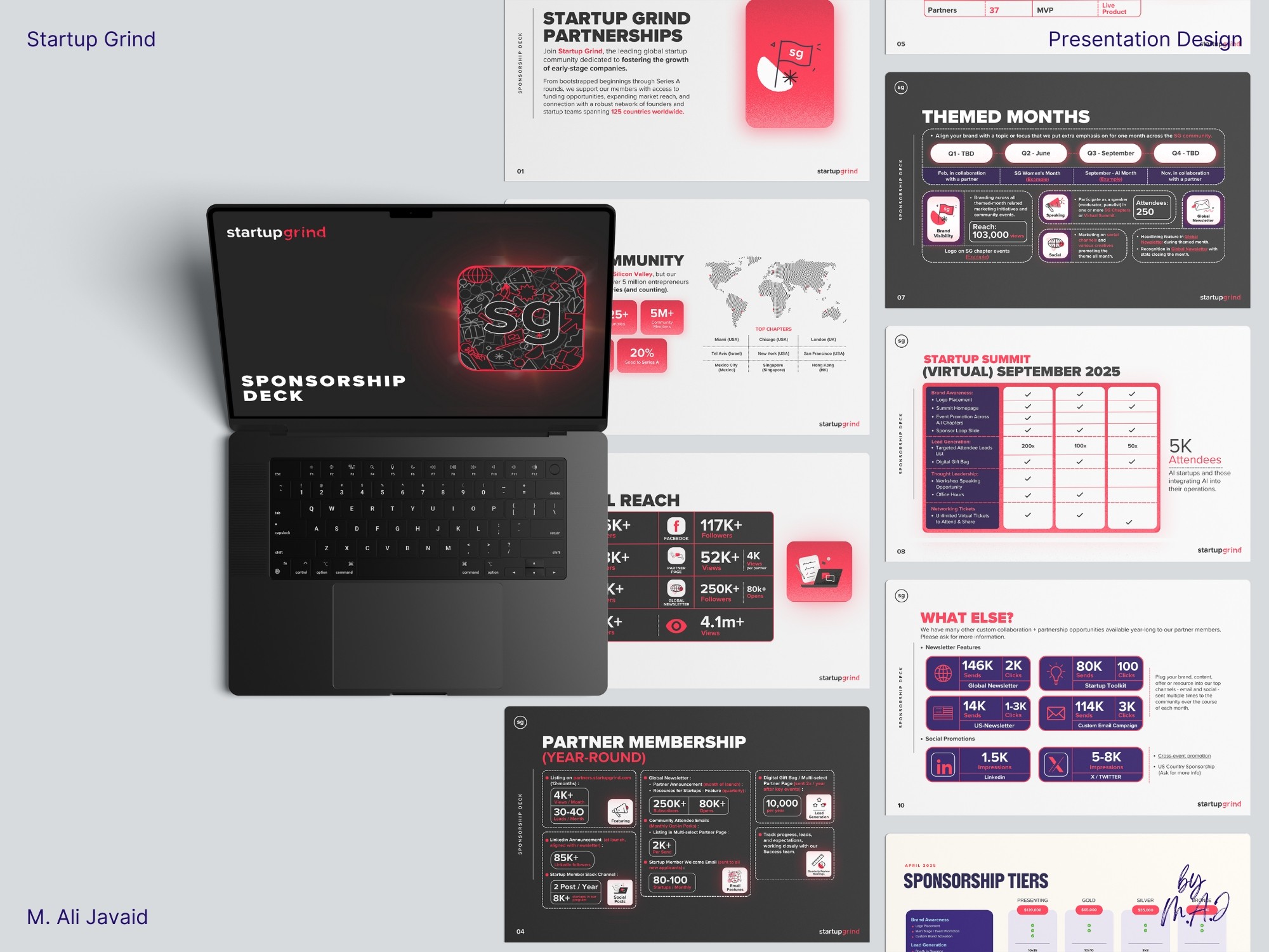
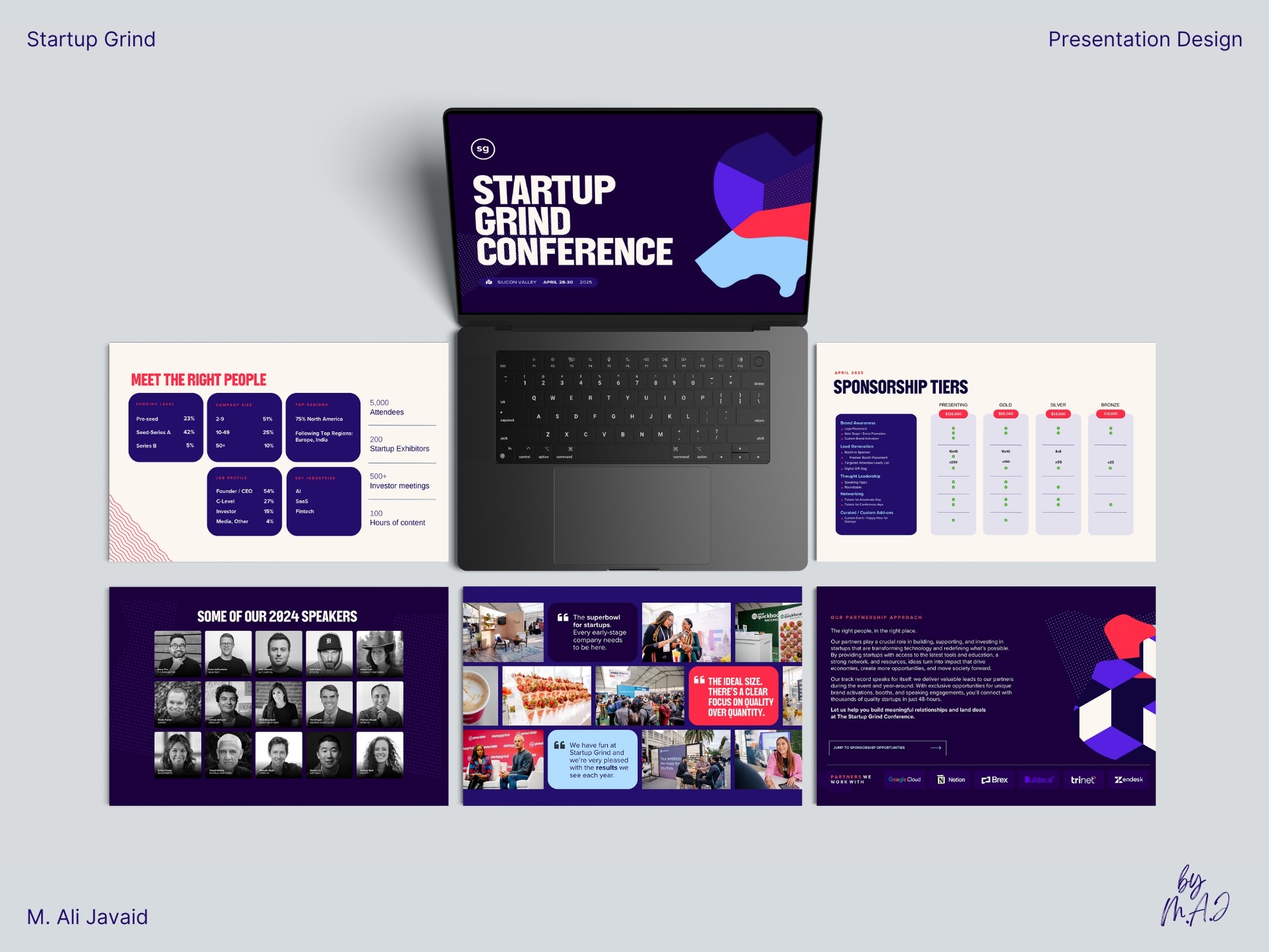
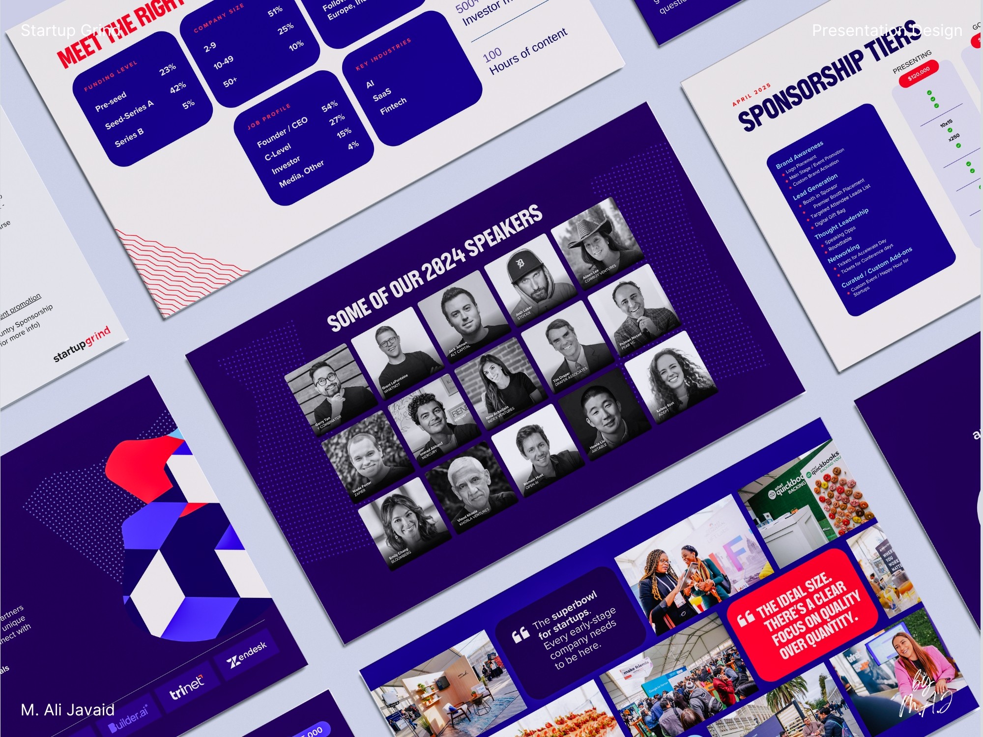
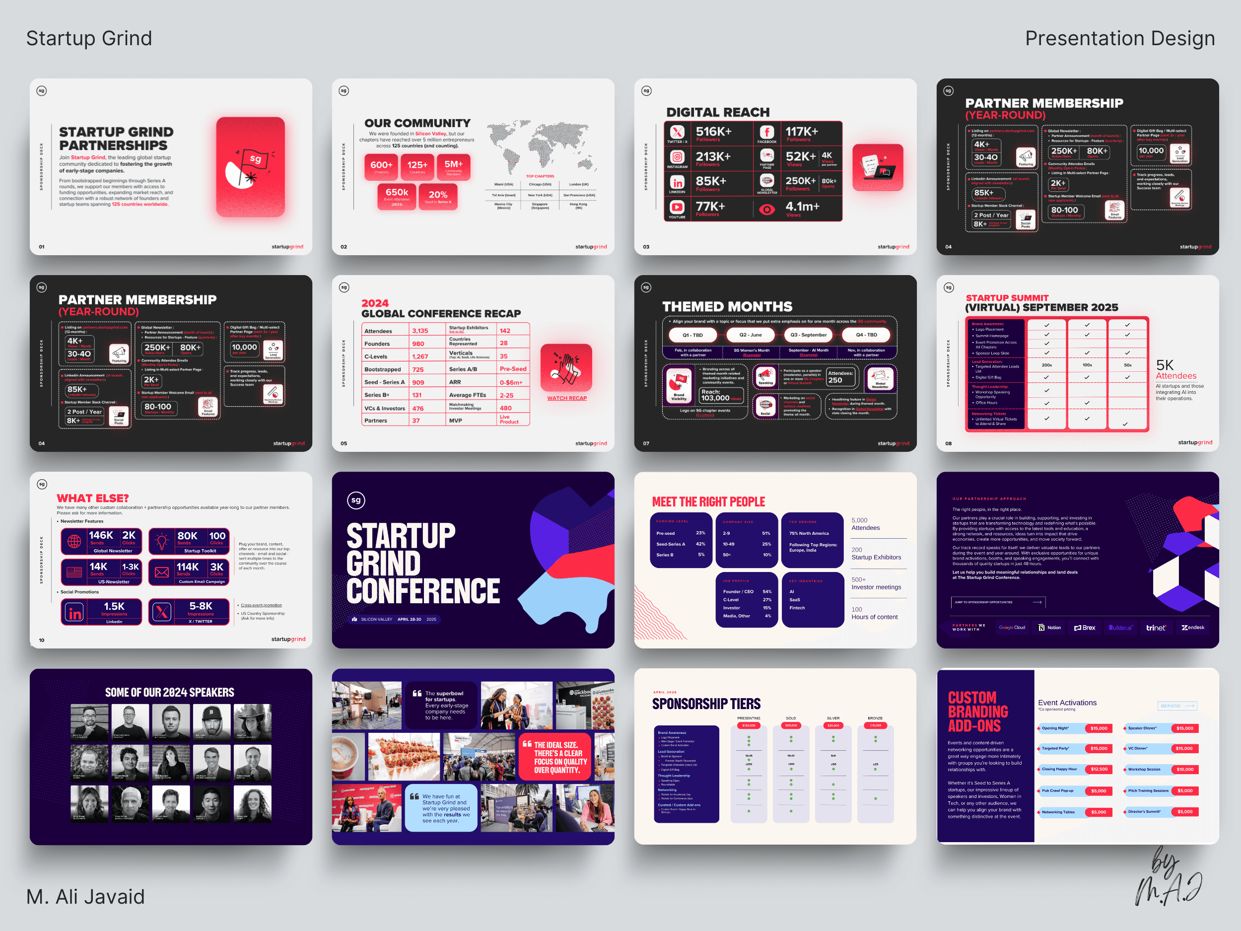
With just 12 days, I was tasked with merging two distinct presentation decks: each with its own brand identity and guidelines: into a single, cohesive 27-page presentation.

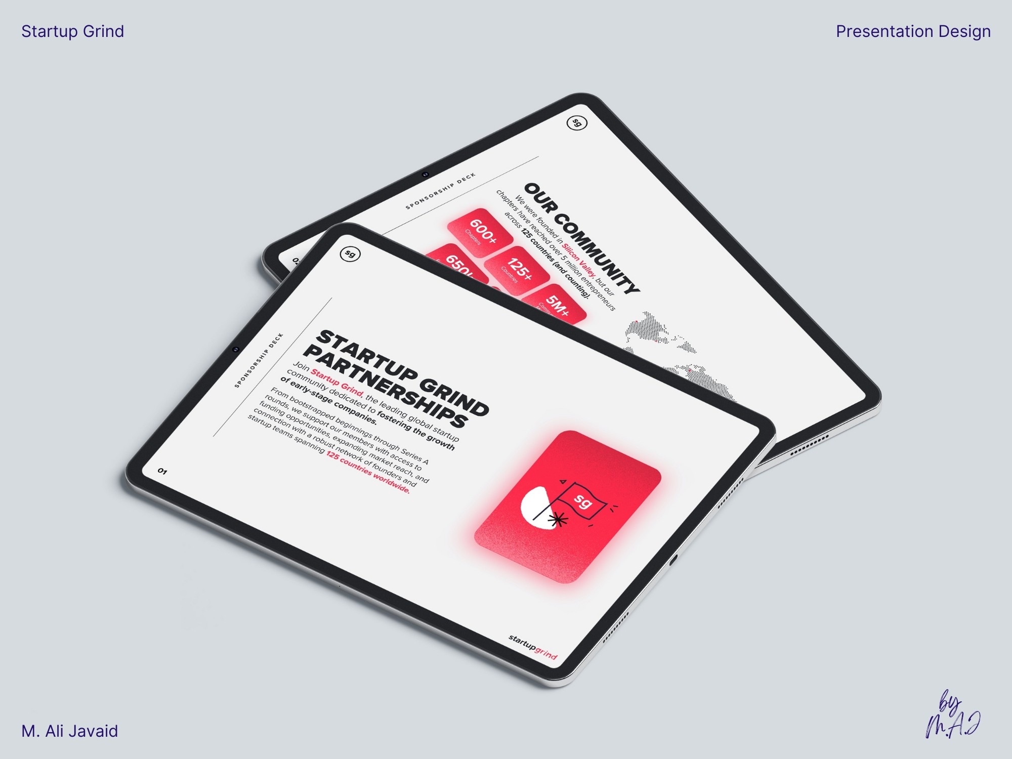
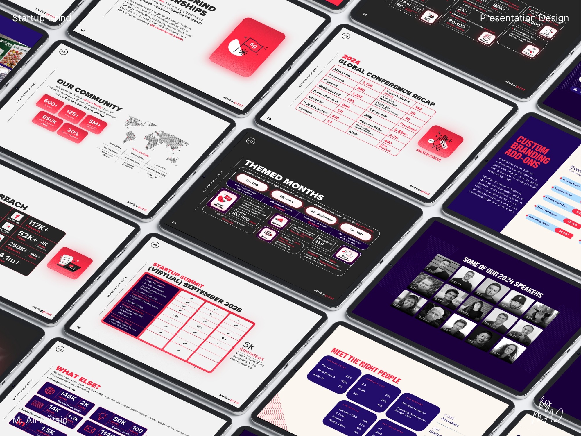
The goal: redesign and create a smooth visual transition so slides 1–12 (brand 1) and 13–27 (brand 2) felt like a single, unified brand: no visual disconnect.

Solution & impact

The original deck lacked energy and cohesion. I reimagined the entire presentation design: replacing flat visuals with custom graphics, modern layouts, and strong visual hierarchy.

Instead of basic color tweaks, I strategically unified two brand identities through color theory and modern custom infographics.

Both brands shared red (#FF2A45), which I used prominently in slides 1–12. From slide 8, I gradually introduced purple (#240E6C) to bridge the shift. The color shift let the second brand from page 13 take over smoothly: meeting the brief for unified design.

The result: a bold, engaging presentation that looked alive, aligned, and professional: leading to a 25% spike in sponsorship inquiries.

  • Startup Grind

  • Startup Grind

  • Startup Grind

Vision Branding
Vision Branding

Solution & impact

The original deck lacked energy and cohesion. I reimagined the entire presentation design: replacing flat visuals with custom graphics, modern layouts, and strong visual hierarchy.

Instead of basic color tweaks, I strategically unified two brand identities through color theory and modern custom infographics.

Both brands shared red (#FF2A45), which I used prominently in slides 1–12. From slide 8, I gradually introduced purple (#240E6C) to bridge the shift. The color shift let the second brand from page 13 take over smoothly: meeting the brief for unified design.

The result: a bold, engaging presentation that looked alive, aligned, and professional: leading to a 25% spike in sponsorship inquiries.

  • Project Gallery

  • Project Gallery

  • Project Gallery

  • Project Gallery

  • Project Gallery

  • Project Gallery

  • Project Gallery

  • Project Gallery

  • Project Gallery

  • Project Gallery

  • Project Gallery

  • Project Gallery

  • Project Gallery

  • Project Gallery

  • Project Gallery

  • Project Gallery

  • Project Gallery

  • Project Gallery

  • Project Gallery

  • Project Gallery

  • Project Gallery

  • Project Gallery

  • Project Gallery

  • Project Gallery

  • Before / After

  • Before / After

  • Before / After

  • Before / After

  • Before / After

  • Before / After

  • Before / After

  • Before / After

  • Before / After

  • Before / After

  • Before / After

  • Before / After

Merging Two Brands Into One Cohesive Story

Merging Two Brands Into One Cohesive Story

Impact

• 25% spike in sponsorship inquiries following the 27 pages purposefully designed, unified presentation design launch.

Creative Thinking

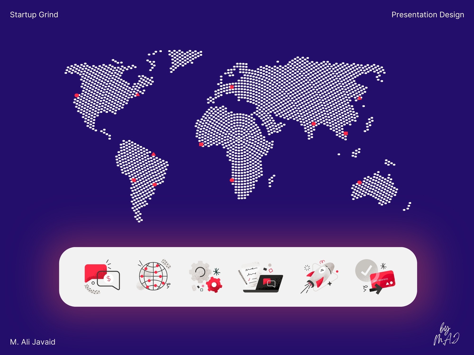
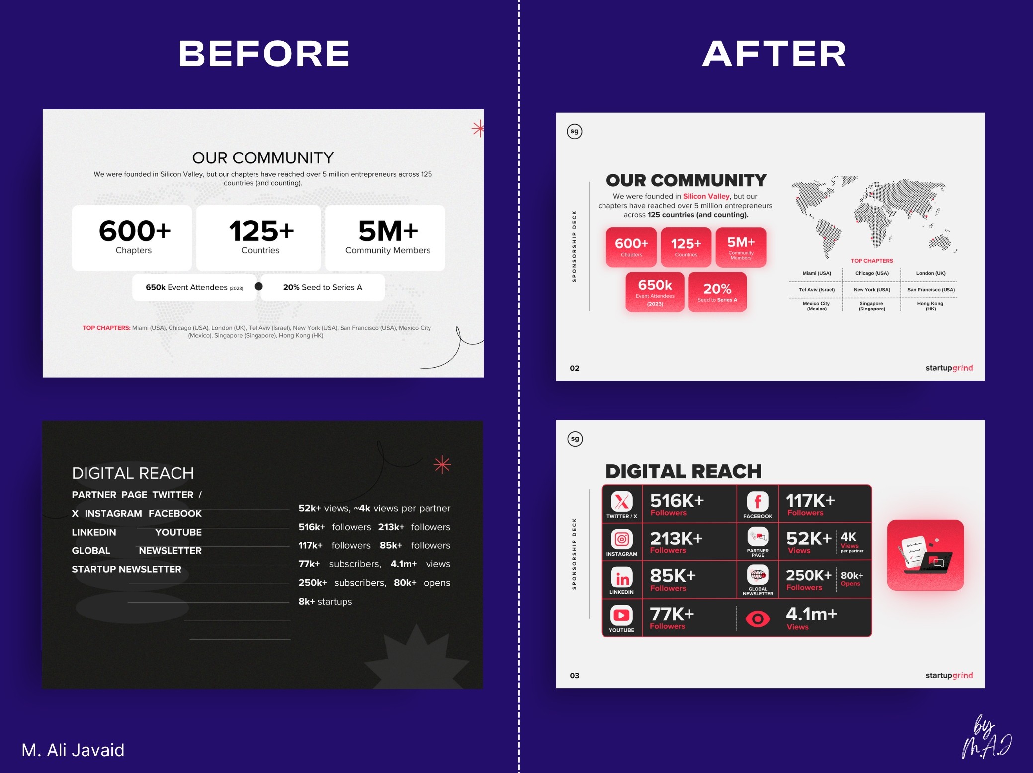
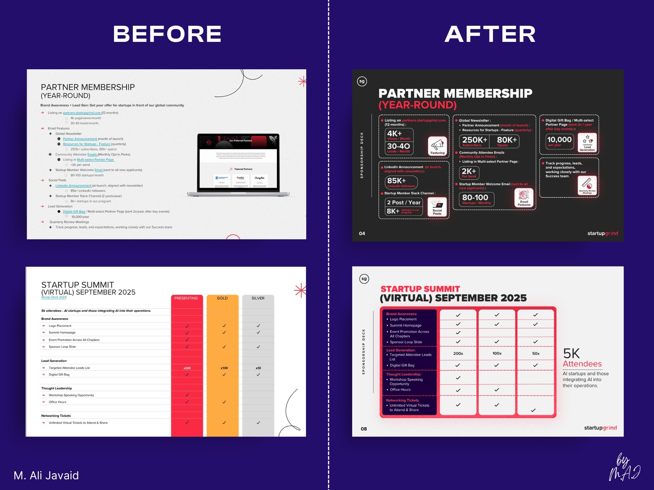
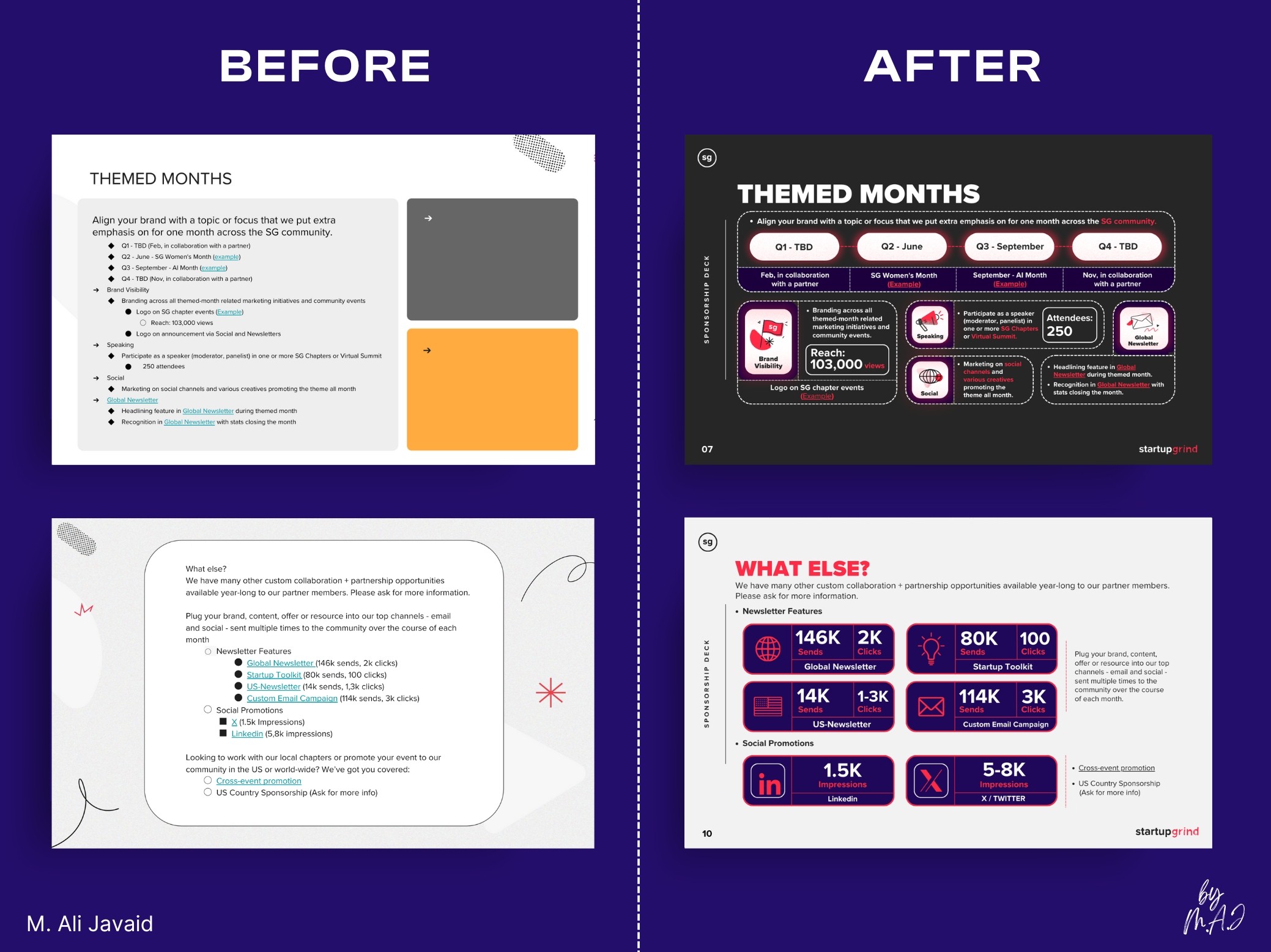
• To merge two distinct brand identities, I used red (#FF2A45: a shared brand color) : as the visual anchor across slides 1–12, setting the foundation for a unified design.

• Starting at slide 8, I gradually introduced purple (#240E6C) to transition into the second brand (slides 13–27), using color theory for a smooth, cohesive shift from 1 brand into another brand.

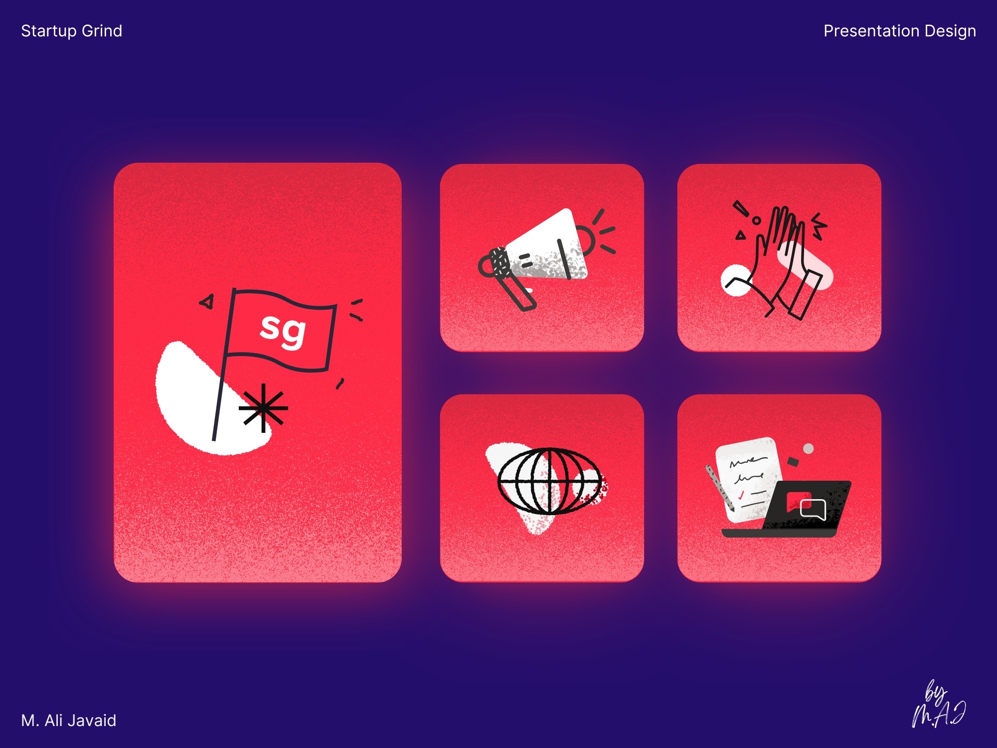
• Using Adobe Illustrator, I designed custom brand elements inspired by static TV noise: adding texture, energy, and a consistent visual identity throughout the deck.

Project Highlights

• Met a tight 12-day deadline driven by urgent launch needs.

• Overcame the challenge of merging two distinct brands into one unified presentation.

• Delivered in Google Slides (primary) and PowerPoint with added animations.

• Used Illustrator to design brand elements and build modern, clean layouts.

• Sponsorship presentation attracted about 25% increase in partnership inquiries than last year's sponsorship campaign.

  • Thanks for watching

Got a new project to discuss

  • Thanks for watching

Got a new project to discuss

  • Thanks for watching

Got a new project to discuss

  • Before / After

  • Before / After

  • Before / After

  • Before / After

  • Before / After

  • Before / After

  • Before / After

  • Before / After

  • Before / After

  • Before / After

  • Before / After

  • Before / After

Create a free website with Framer, the website builder loved by startups, designers and agencies.