Client
Software used
ADOBE CC (INDESIGN & ILLUSTRATOR)
Services
CATALOGUE & PUBLISHING DESIGN | LAYOUT & CUSTOM GRAHICS | COPYWRITING
Website
Problem & Goal
What happens when a sports brand wants to stand out: without using its signature colors? That was the challenge.
In March 2023, I joined No Errors, a U.S. brand known for customizable baseball and softball gear. I started working on their full custom product line: team merchandise design, 3d mockups, marketing materials and factory discussion as a job.
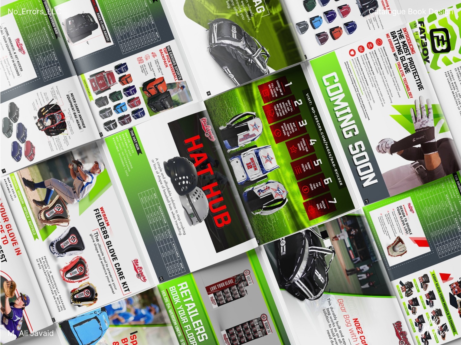
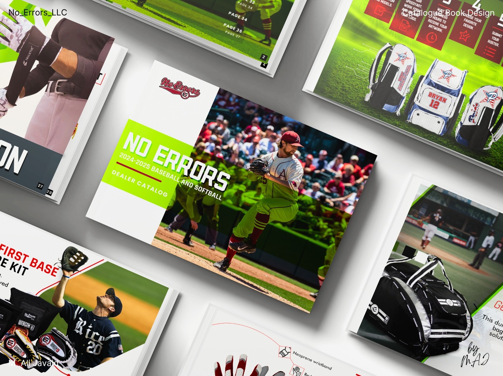
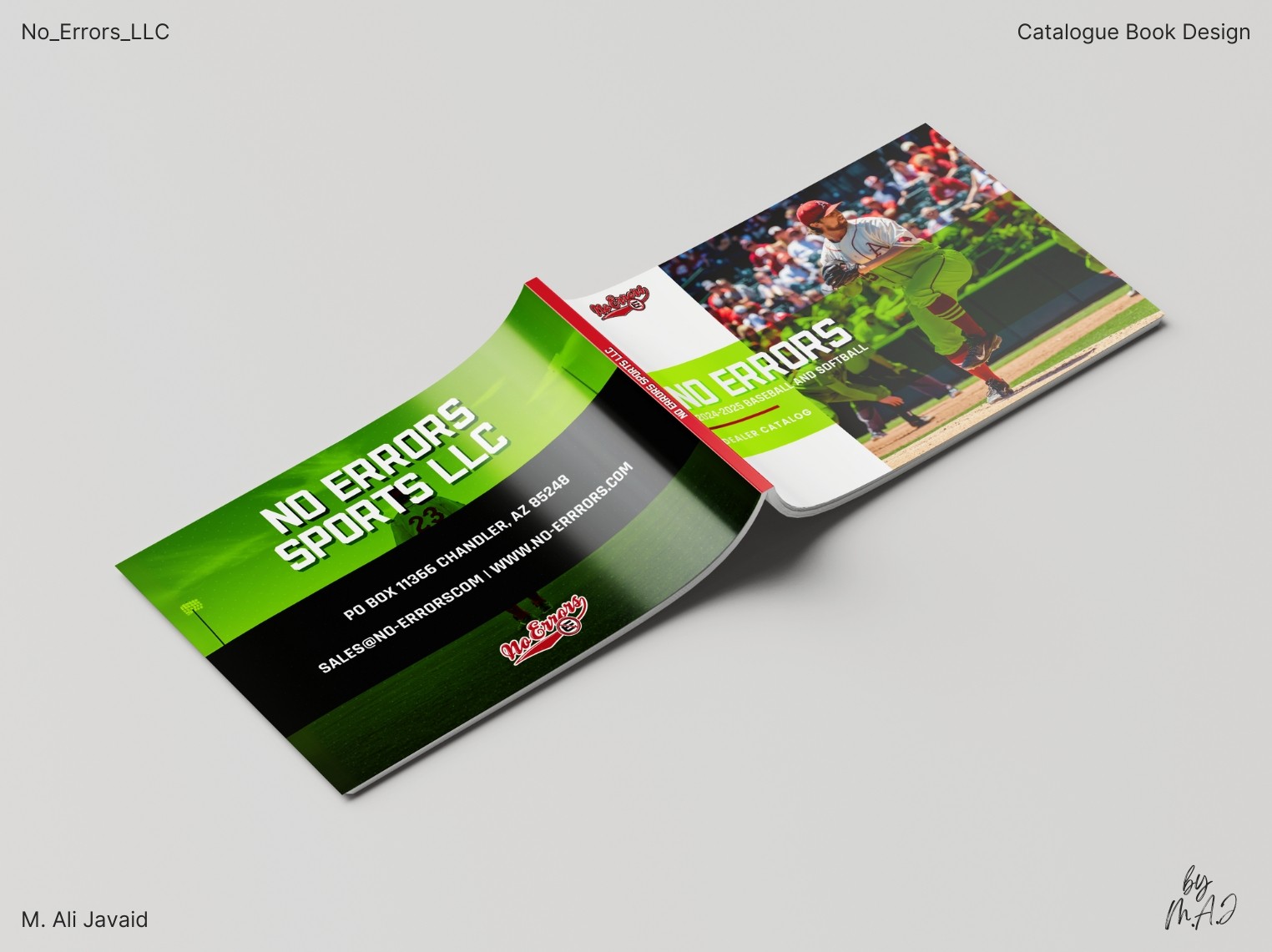
After a year and a half of working together, founder Ron Reed asked me to take on something new: a 46-page catalog book (print and digital) to showcase the brand and support vendor sales.
It was my first time designing a catalog book: but I didn’t hesitate. I didn’t see it as a challenge. I saw it as a chance to expand my experience. I replied "Hell Yeah!" (literally that was my reply :)
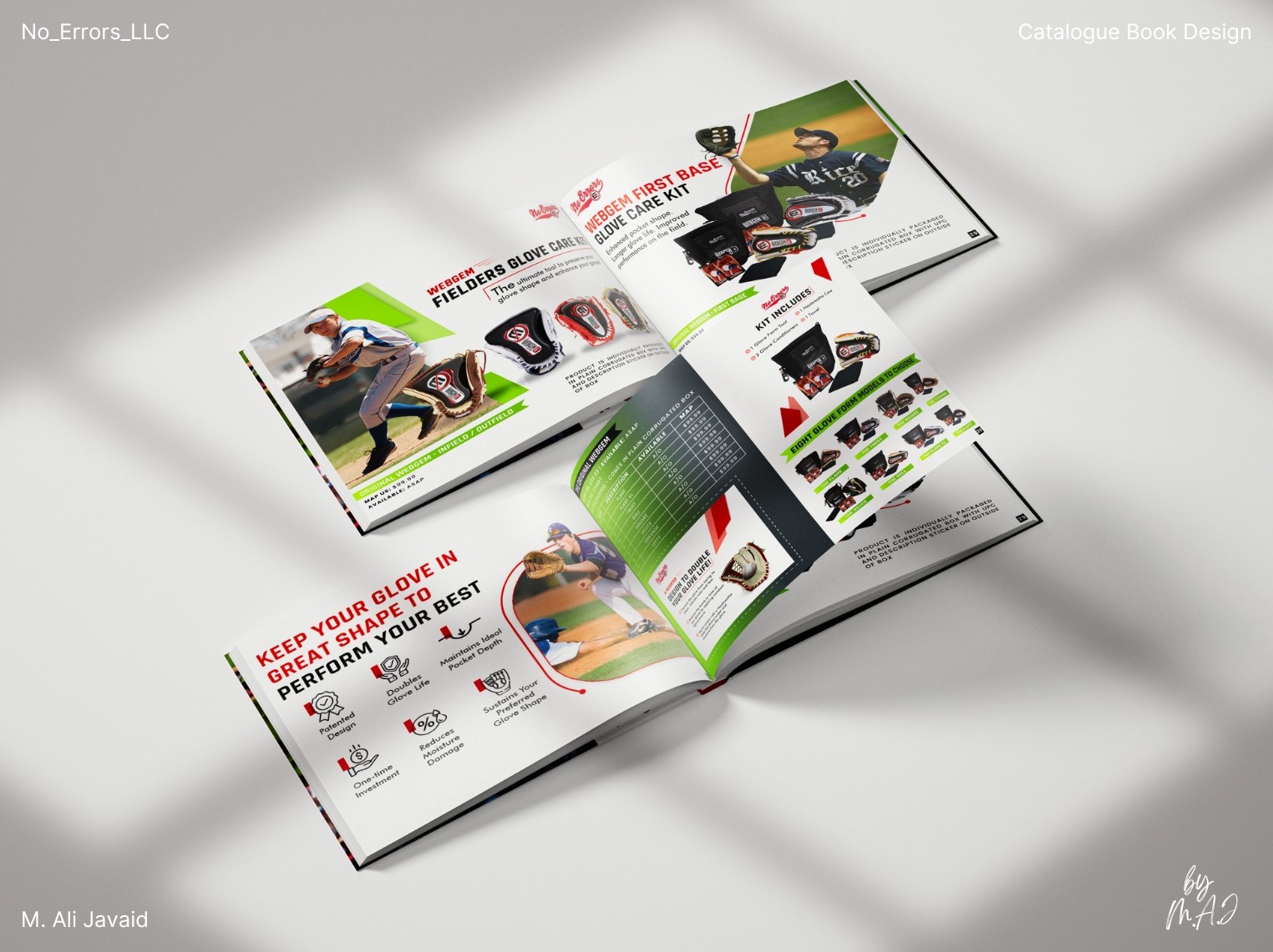
The goal: design a catalog that clearly communicates the product range, reflects the brand’s identity, and dives into each product with clarity. Ron emphasized a new visual direction: no red or blue. He wanted a fresh look that felt connected to the sport, but unlike anything they’d done before.
Impact
• Full customizable product line generated $82K+ in year one, doubling to $175K+ in year two.
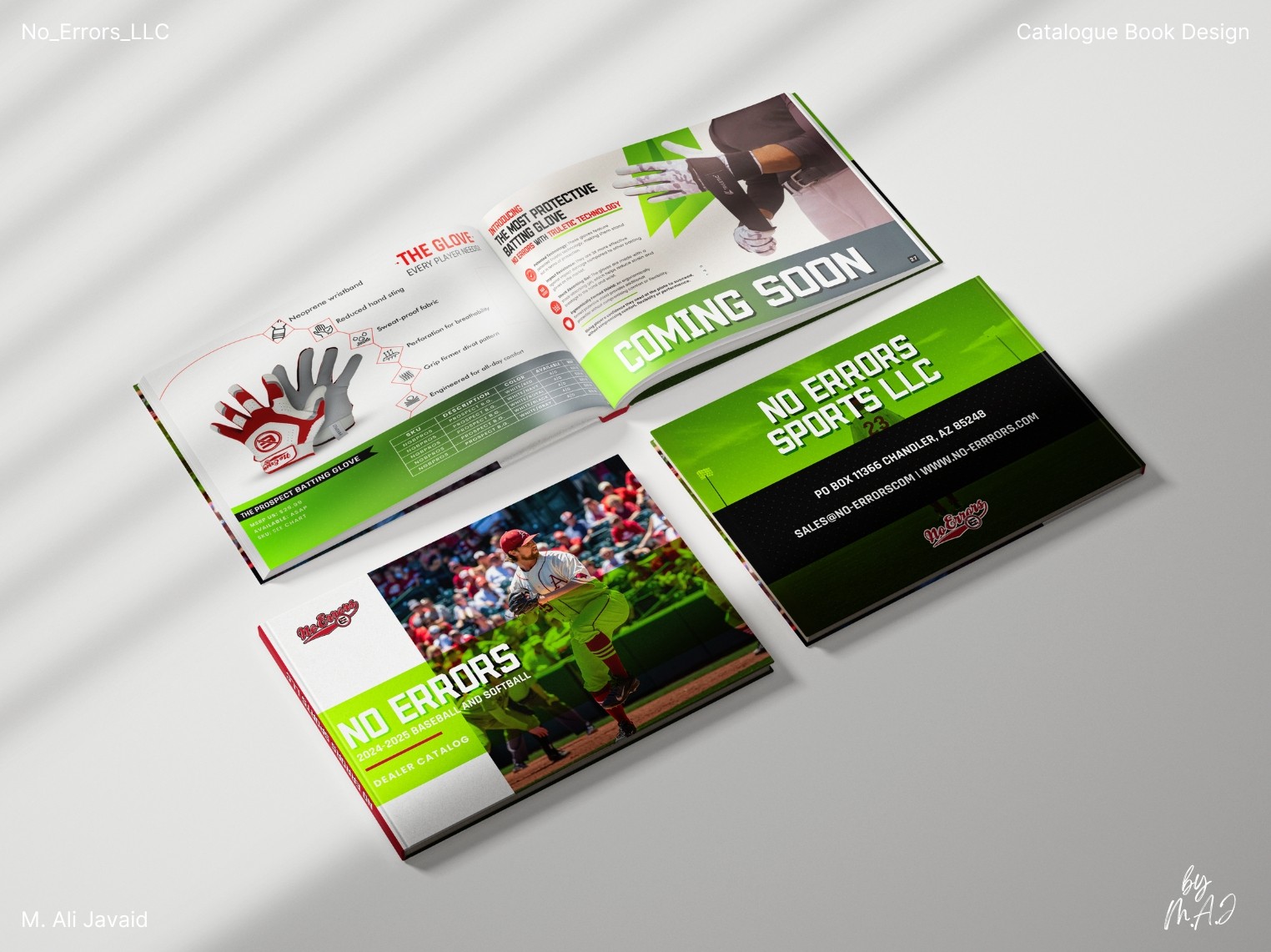
• Designed a 46-page catalog book (physical print and PDF), with the digital version prioritized for sustainability and ease of access: giving vendors a paper-free, on-the-go resource, affordable option and fastest way to send across US.
Creative Thinking
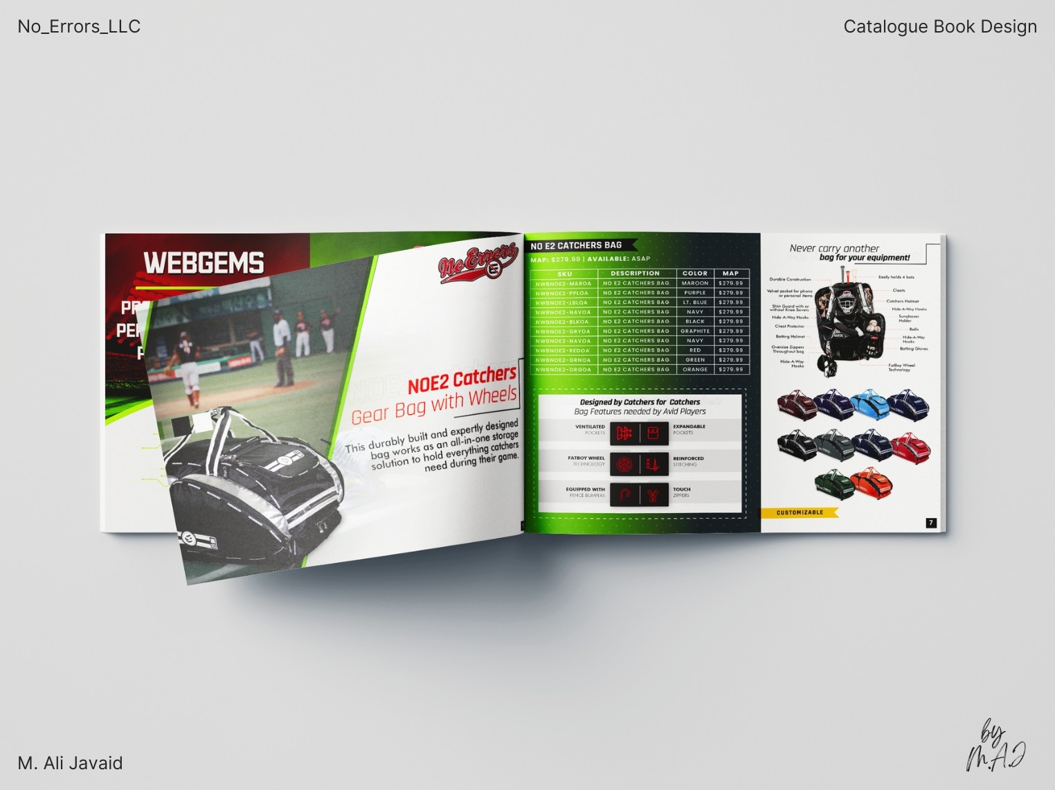
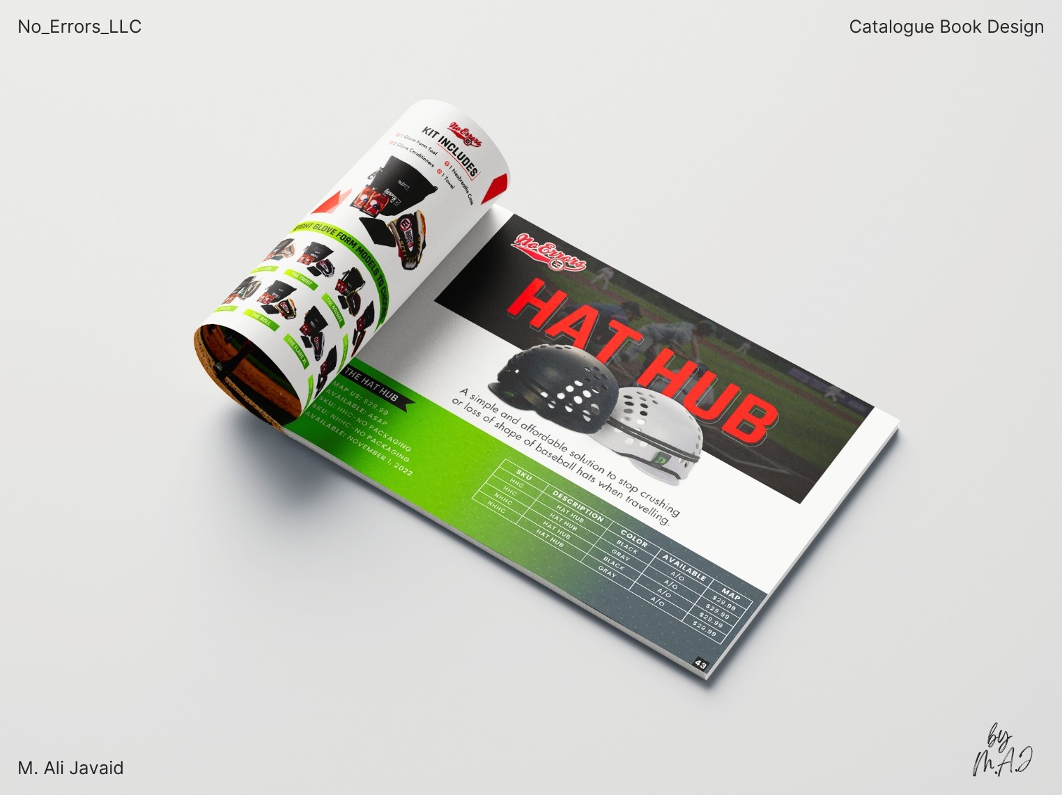
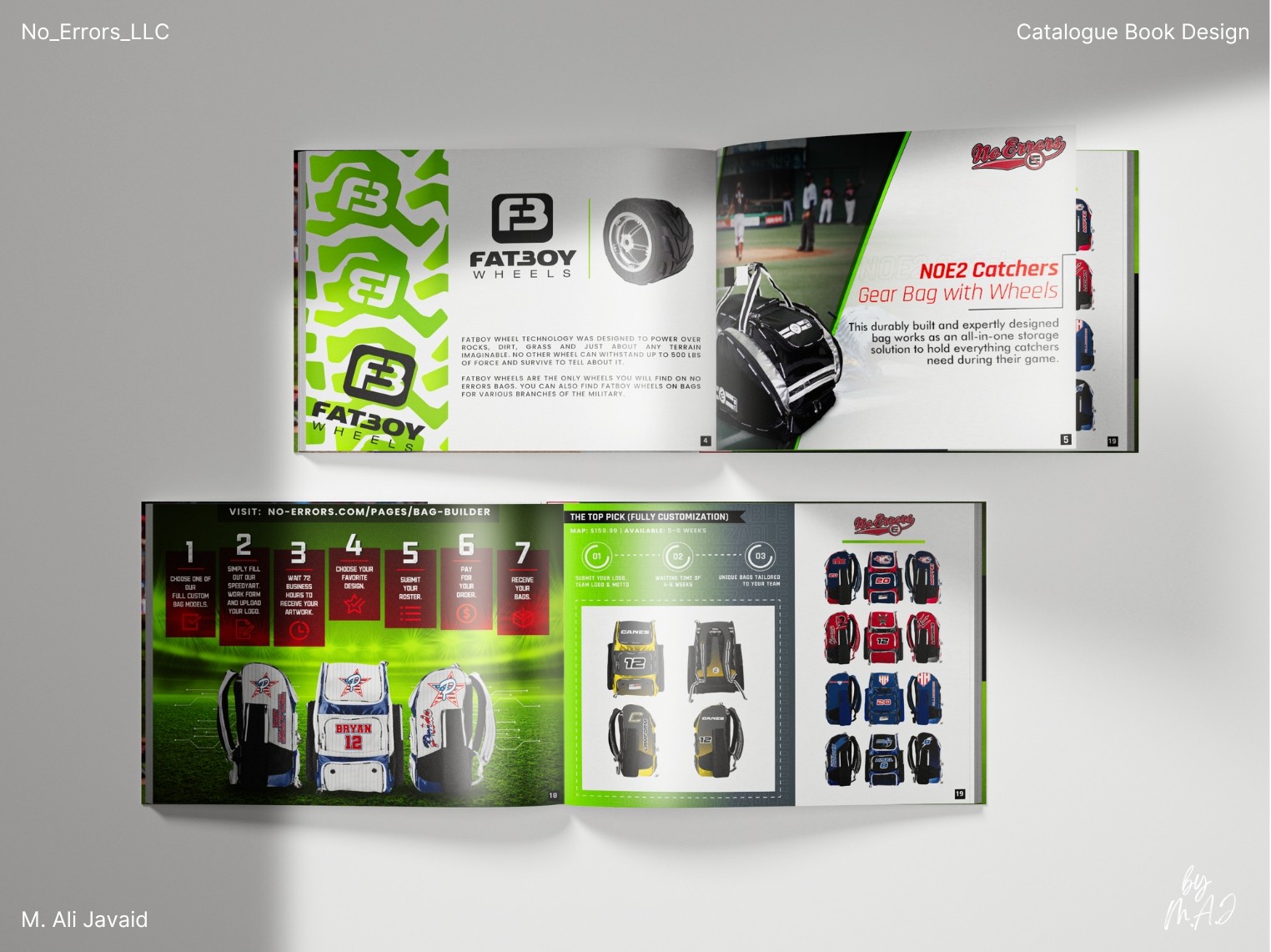
• I treated the catalog as more than a list of products: it had to sell the brand without selling. I used Adobe Illustrator for clean product visuals and Adobe InDesign for layout control, building each page to guide, not overwhelm.
• With red and blue (primary brand colors) off the table, I introduced "#9ACD32." This choice wasn’t random: a yellowish-green drawn from softballs and field grass. It kept the catalog rooted in the sport, while white space and red headings echoed the clean simplicity of baseball: resulting in a look that was robust and focused.
• The prioritized PDF version became a central part of the design process: not just as a digital copy, but as a tool for vendors: easy to send, quick to open, and more sustainable than print alone.
Project Highlights
• First time challenge of designing a catalog book.
• Handled catalog and product line design simultaneously under tight timelines.
• Introduced #9ACD32 to replace standard brand colors.
• Used Illustrator and InDesign to create clean, print-ready layouts.
• Prioritized PDF for easy sharing, fast updates, and reduced paper use.
