Client
Software used
ADOBE ILLUSTRATOR | ADOBE PHOTOSHOP | FIGMA | MICROSOFT POWERPOINT
Services
BRAND IDENTITY & LOGO DESIGN | CREATIVE DIRECTION & BRAND GUIDELINES | ICONOGRAPHY | PRESENTATION & TEMPLATE DESIGN
Website
Problem & Goal
Balancing bold simplicity with lasting meaning: where minimalism meets just enough maximalism. That was the real challenge behind Klarinet’s brand transformation.
Klarinet Solutions, one of the leader in digital workplace consulting, helps organizations simplify the way people work, connect, and collaborate through digital tools like Microsoft 365 and SharePoint. But their old identity no longer reflected that purpose. It felt outdated, inconsistent, and failed to build trust with clients navigating digital transformation.
The goal was to create a new logo and visual identity that followed the current flat design trend: but not just another flat, forgettable mark.
The challenge was to strike the right balance between minimalism and maximalism: clean, modern simplicity with just enough depth, detail, and symbolism to give the brand character and longevity. A brand that would feel fresh today and timeless tomorrow.

Impact
With ready-to-implement templates and a clear marketing direction in place, Klarinet rolled out its new identity across proposals, presentations, and campaigns: fast.
• 100% internal adoption in the first month (with ready-to-implement templates), as teams quickly embraced the new branded templates.
• 40% faster proposal turnaround, thanks to pre-built assets that reduced design and formatting time.
• 65% improvement in lead quality, driven by a brand identity that better reflected Klarinet’s value and focus.
• 30% increase in lead-to-demo conversions, as messaging and visuals resonated faster with prospects.
• 48% rise in proposal acceptance, due to greater visual clarity, consistency, and trust at first glance.
Creative Thinking
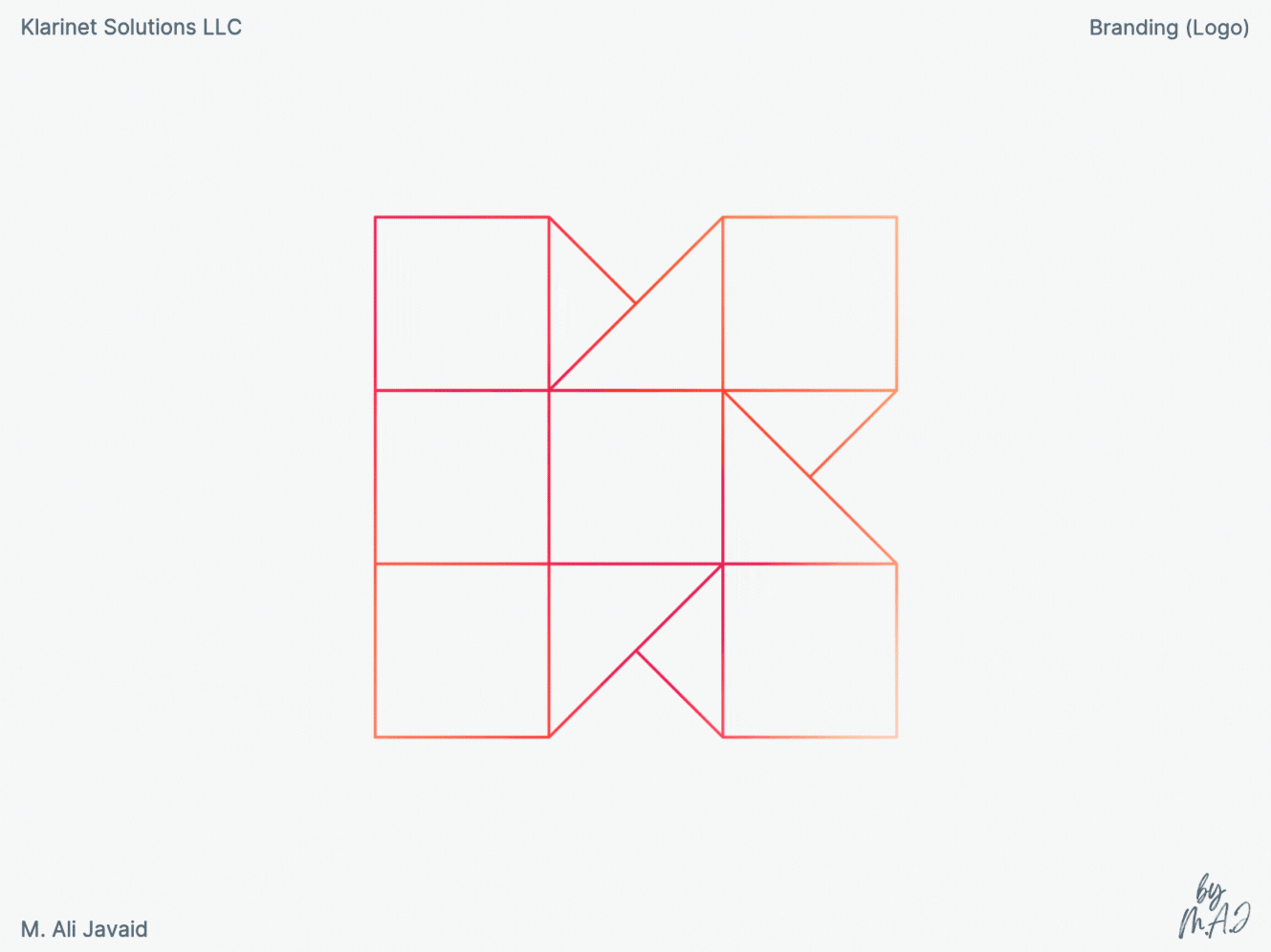
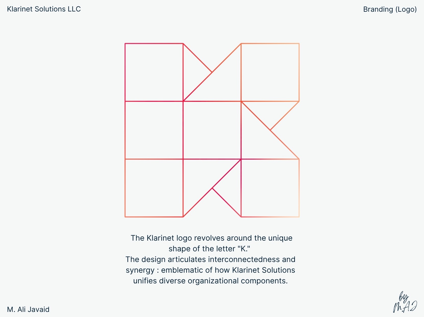
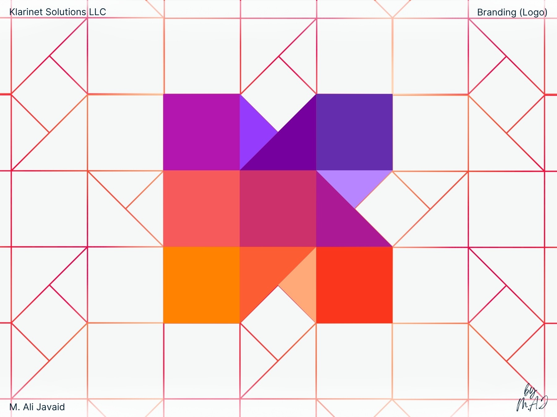
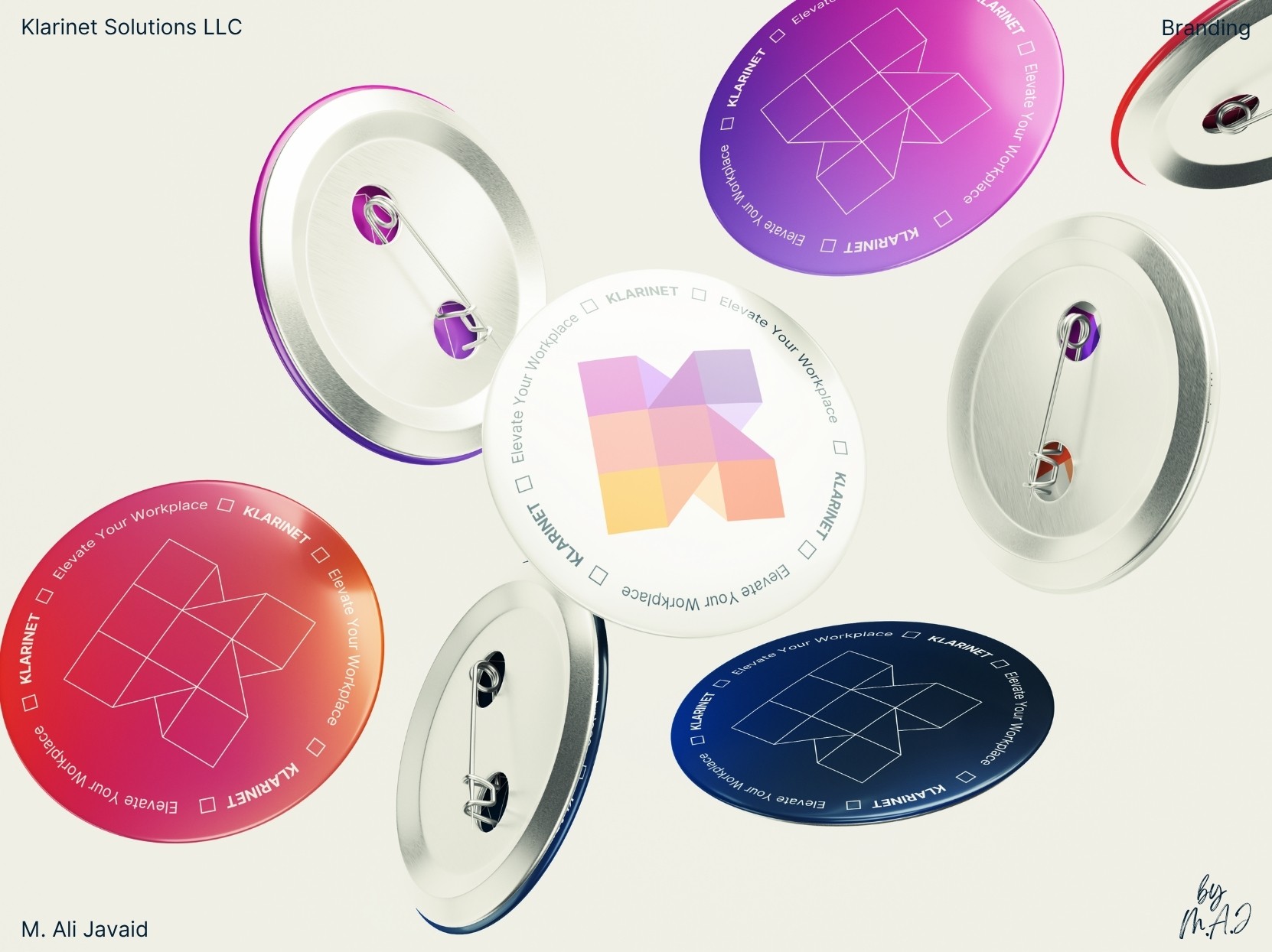
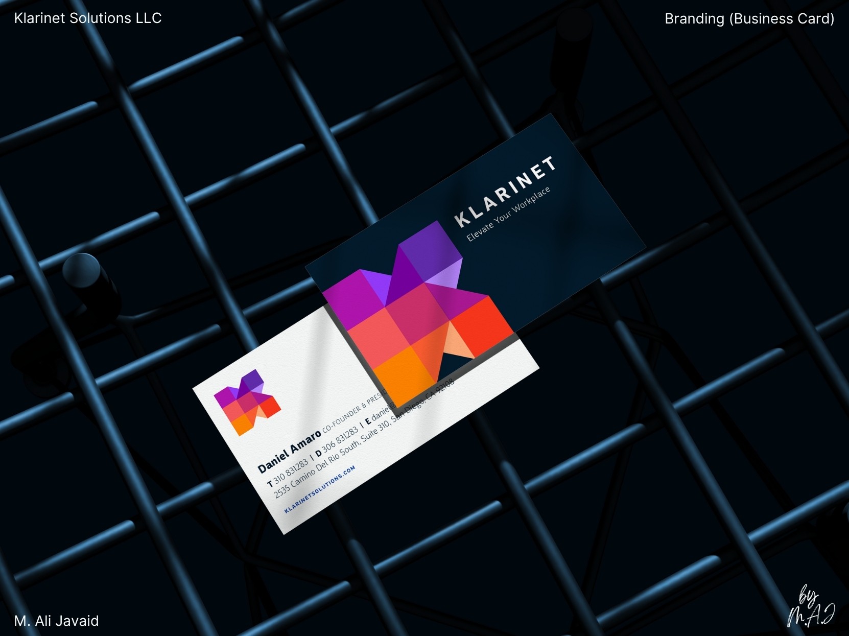
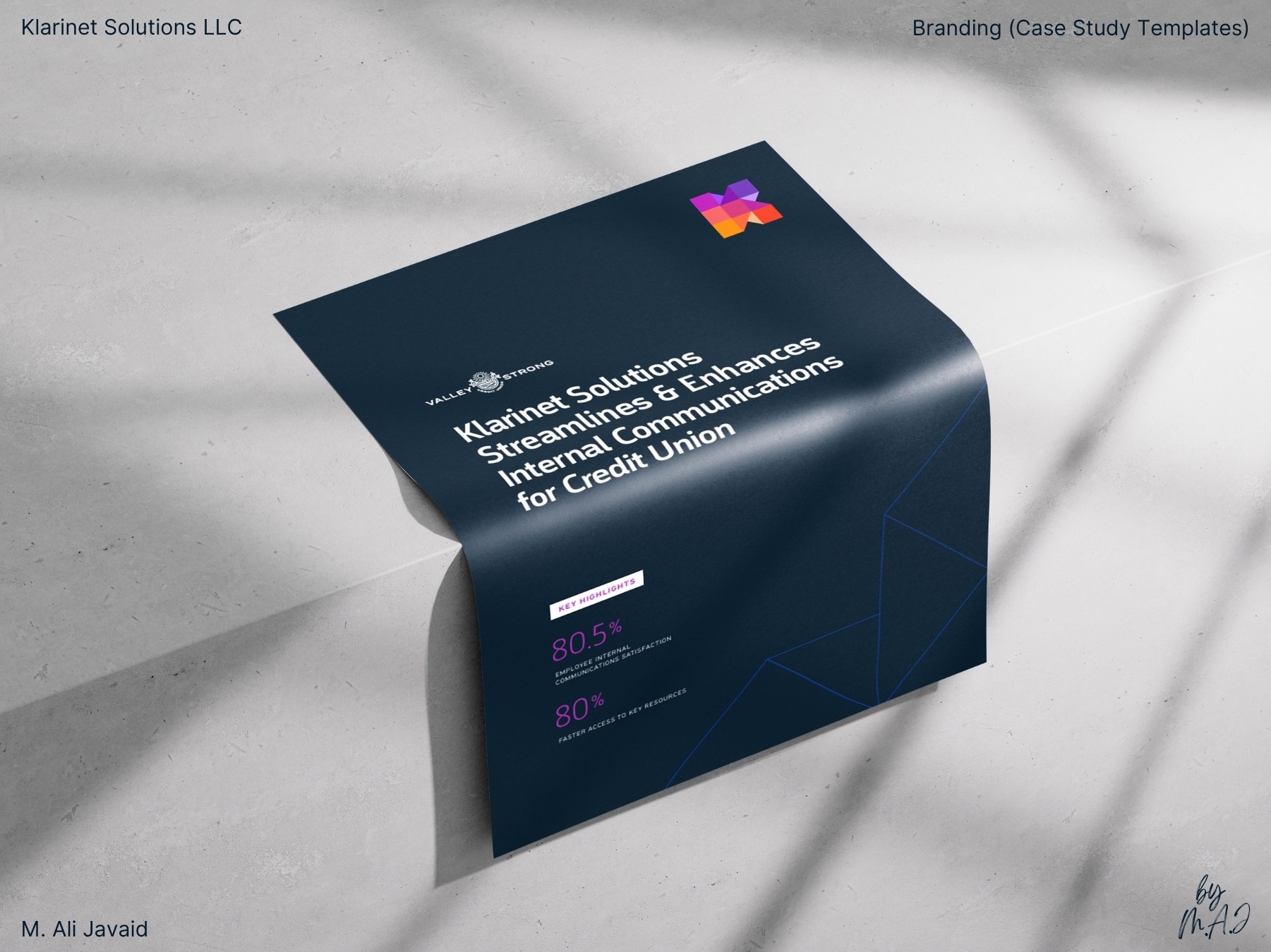
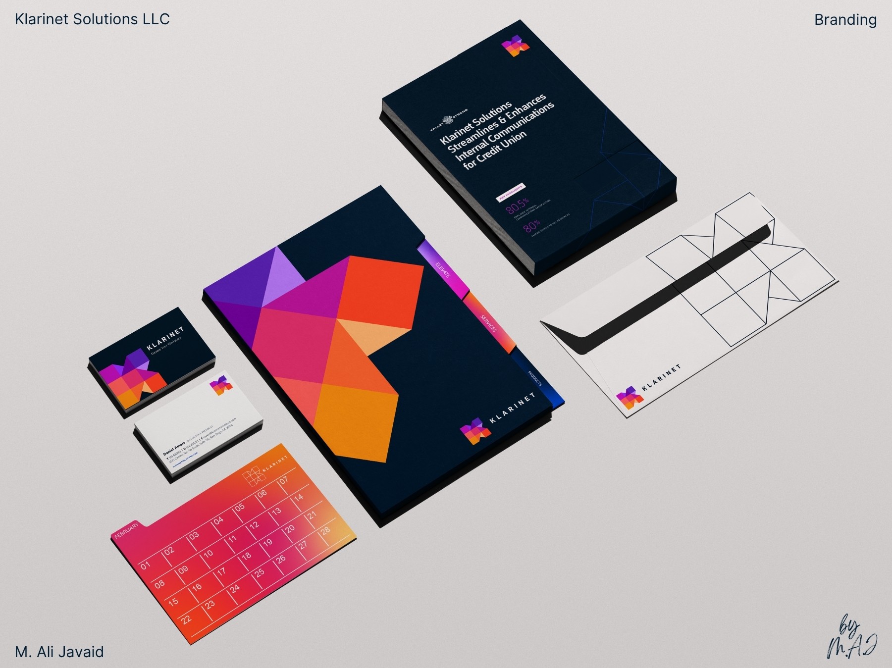
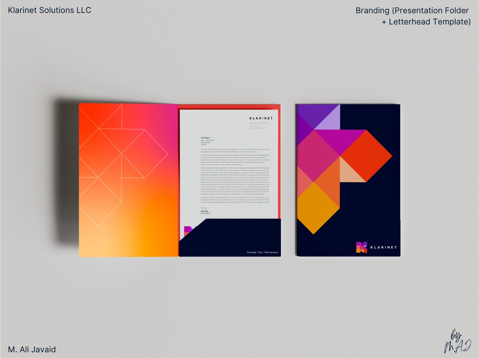
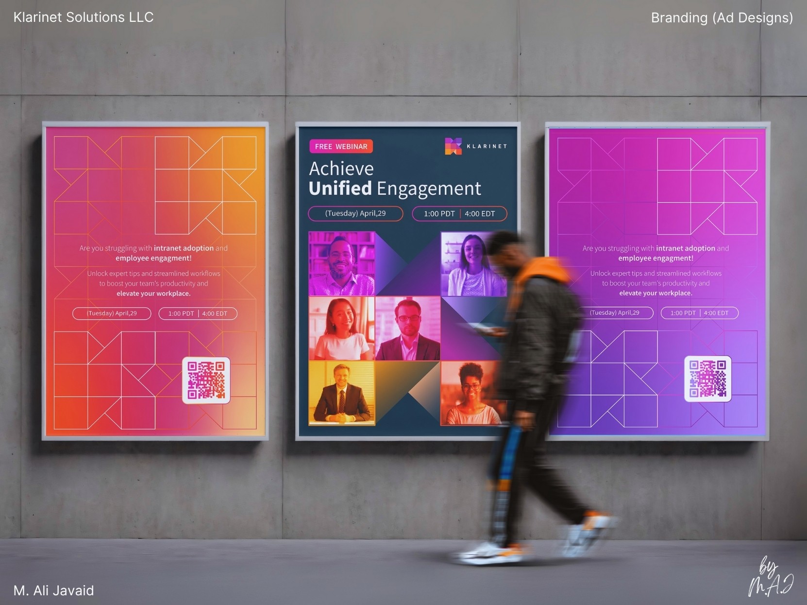
• Built the “K” logo using connected geometric lines: a visual system that reflects how Klarinet unifies Microsoft 365, SharePoint, and Teams.
• Gave each segment of the logo its own color: symbolizing different teams working together as one. So that it doesn't look like some another minimal flat logo.
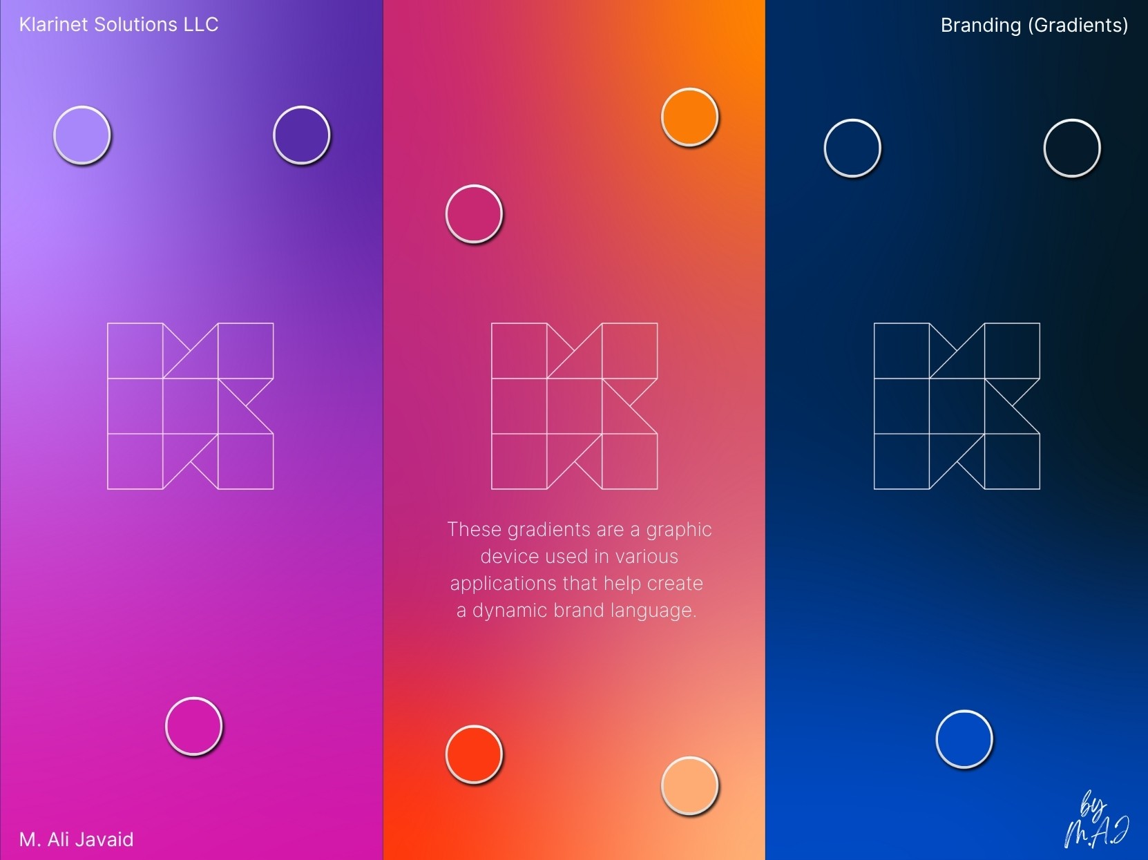
• Chose navy as the original lead color (to not alienate their old customers): trusted, stable, and familiar to long-time clients.
• Inspired by circuit boards, I used gradients as a hidden layer beneath the brand’s surface. Navy anchors the top layer (trustworthy and stable) but as content gets deeper, the solid “K” logo breaks into flat lines. Those lines extend and pulse with gradient color: symbolizing hidden collaboration and connection under any digital workplace.
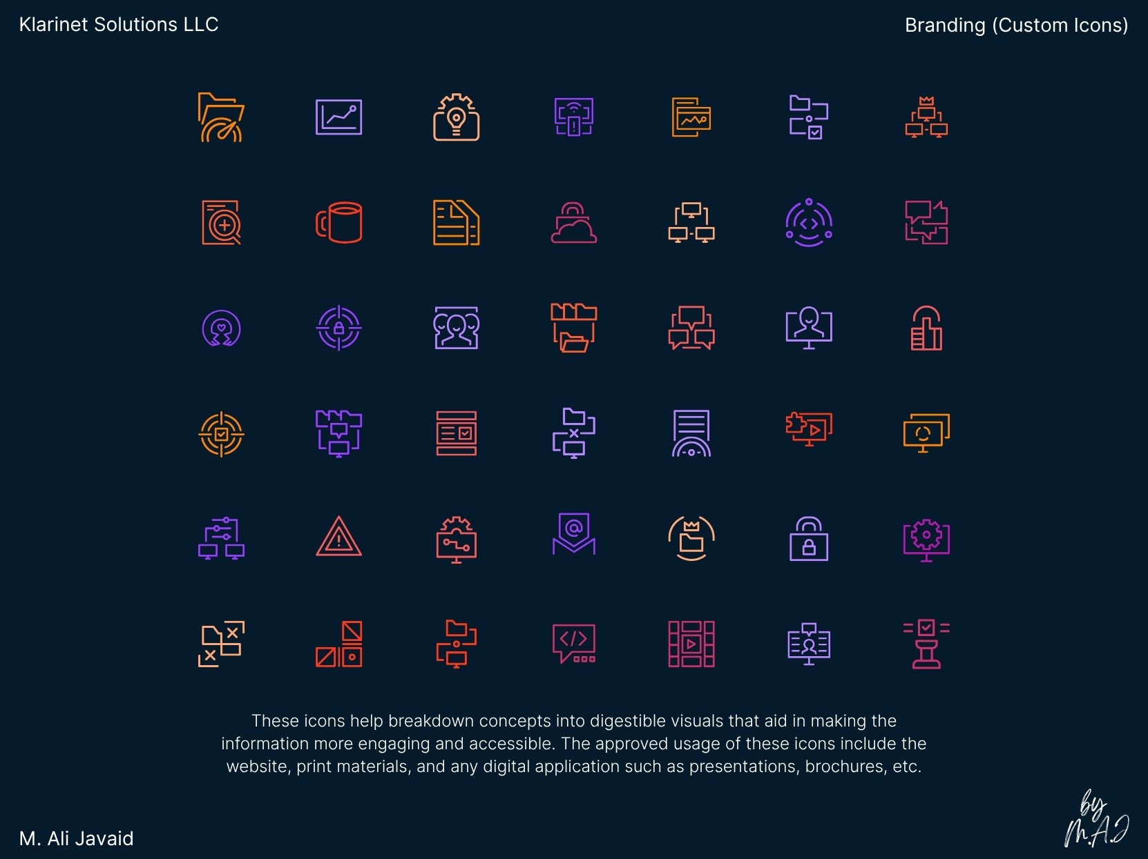
• Designed custom minimal icons in Figma: clean but open, to balance simplicity with character.
Project Highlights
• Founder asked for a logo that stood out: not just another flat trend. Also a balance between minimal and maximalism.
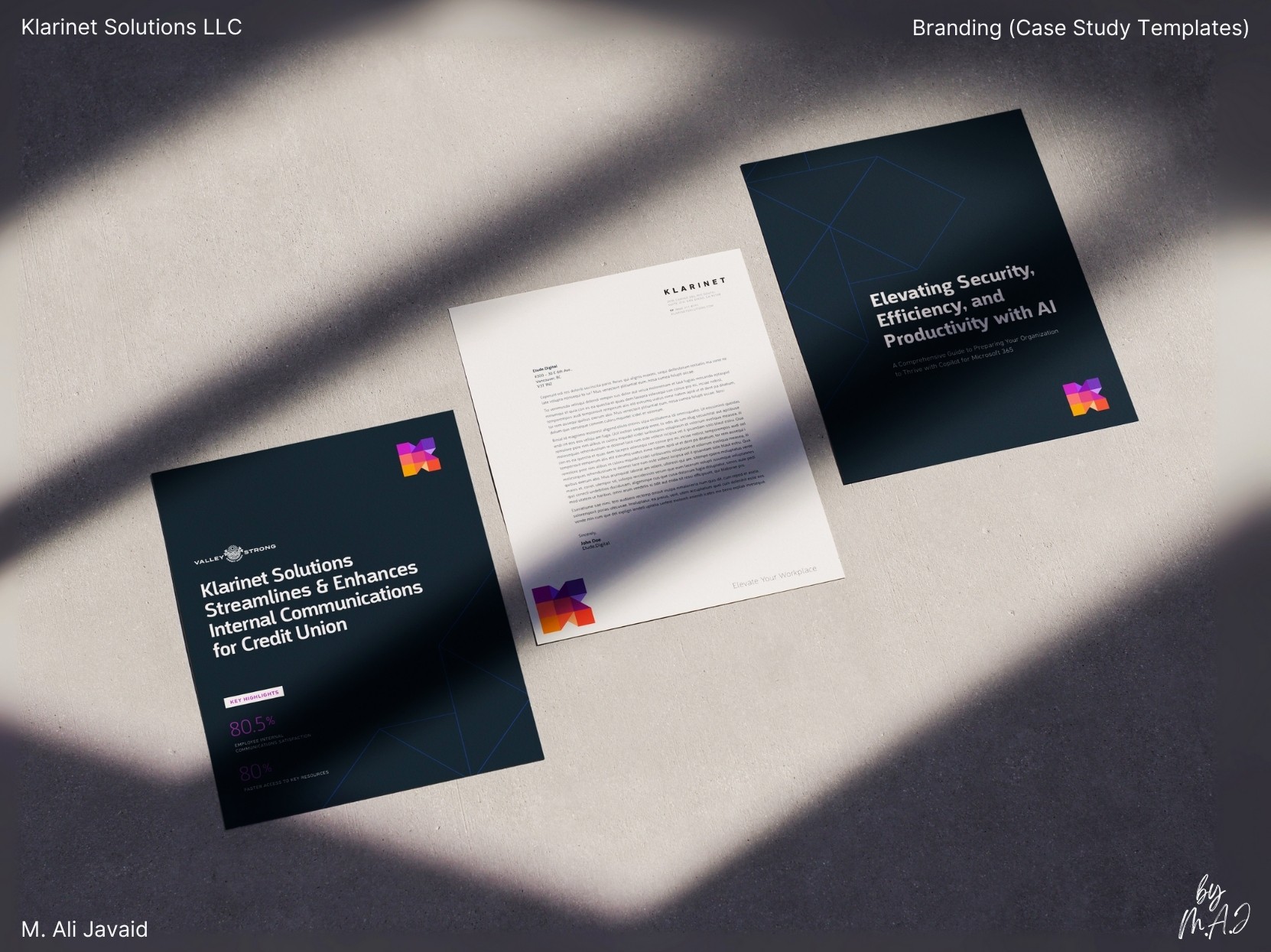
• Built ready-to-use templates for decks, ads, proposals, and internal tools for quick adaptation.
• Achieved full internal adoption in 30 days, improving efficiency and clarity across teams.
• Used Illustrator and InDesign to create clean, print-ready layouts.
• Prioritized PDF for easy sharing, fast updates, and reduced paper use.
• Used Adobe Illustrator to craft the geometric “K” and supporting brand elements.
• Applied Photoshop for image treatments, mockups, and marketing visuals.
• Designed icons, templates, and UI components in Figma for system consistency.
• Built final presentations and proposal decks in Microsoft PowerPoint for client-ready delivery.
