Freedom Event 2025

Freedom Event 2025

Freedom Event 2025

Client

IAN CHEW

IAN CHEW

Software used

Figma and Adobe Illustrator

Services

Event Marketing | Social Media Strategy | Promotional Design | Branded Event Assets

Website

homeservicefreedom.com

homeservicefreedom.com

Problem & Goal

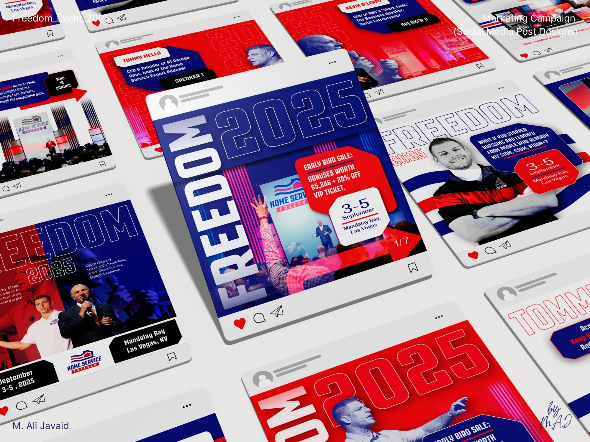
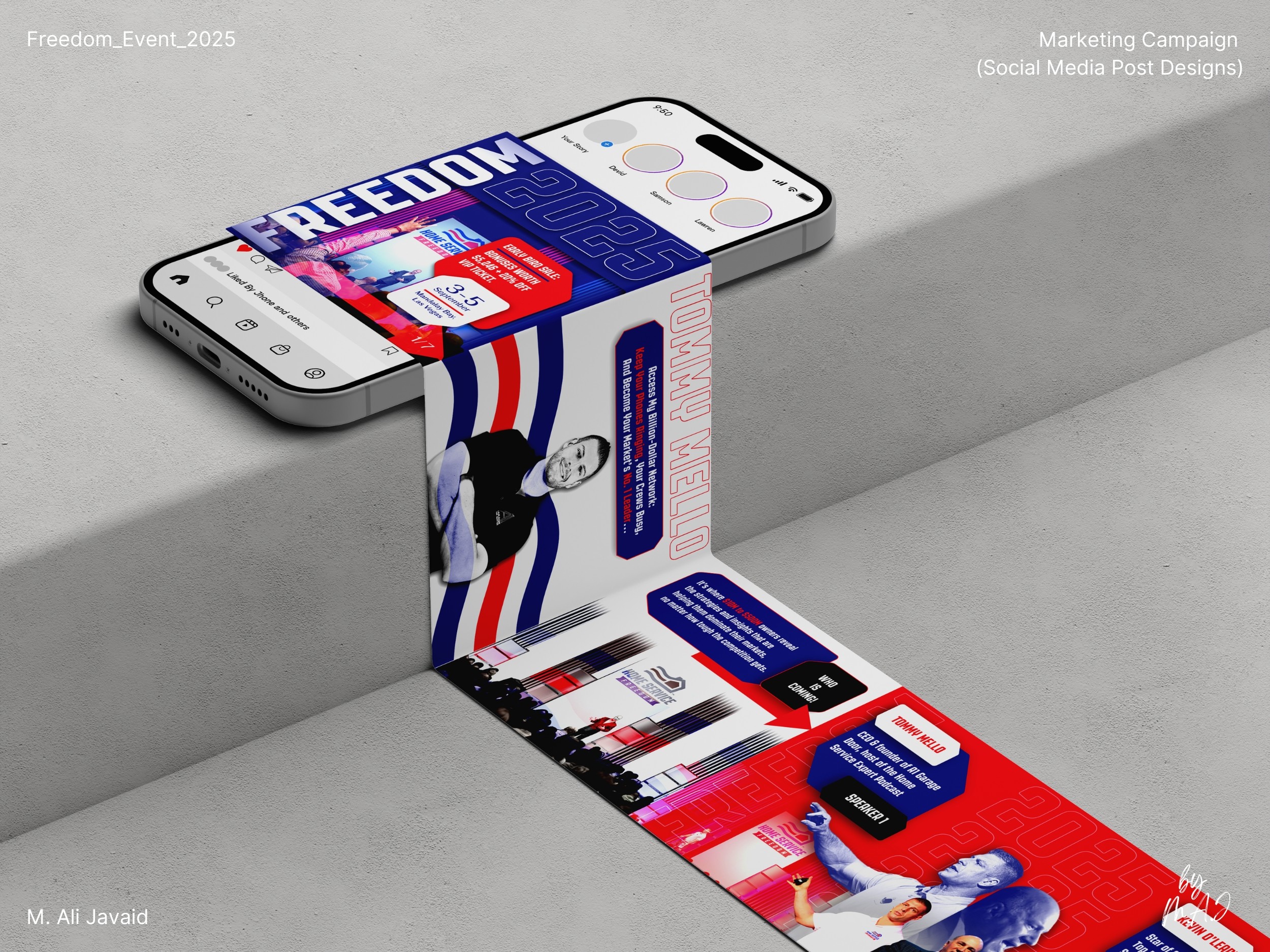
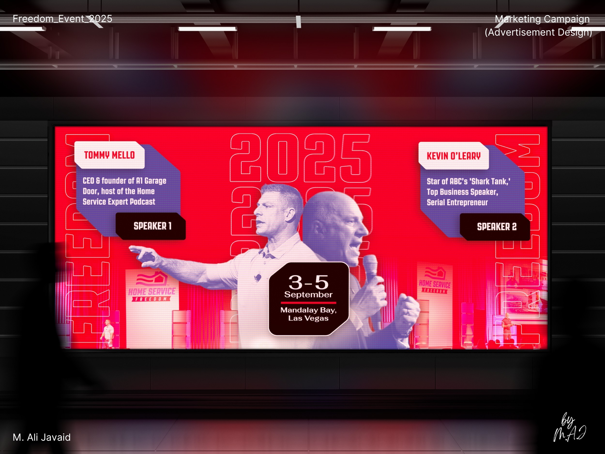
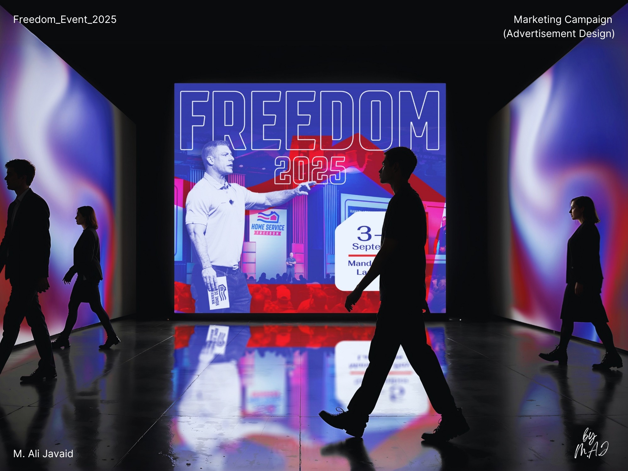
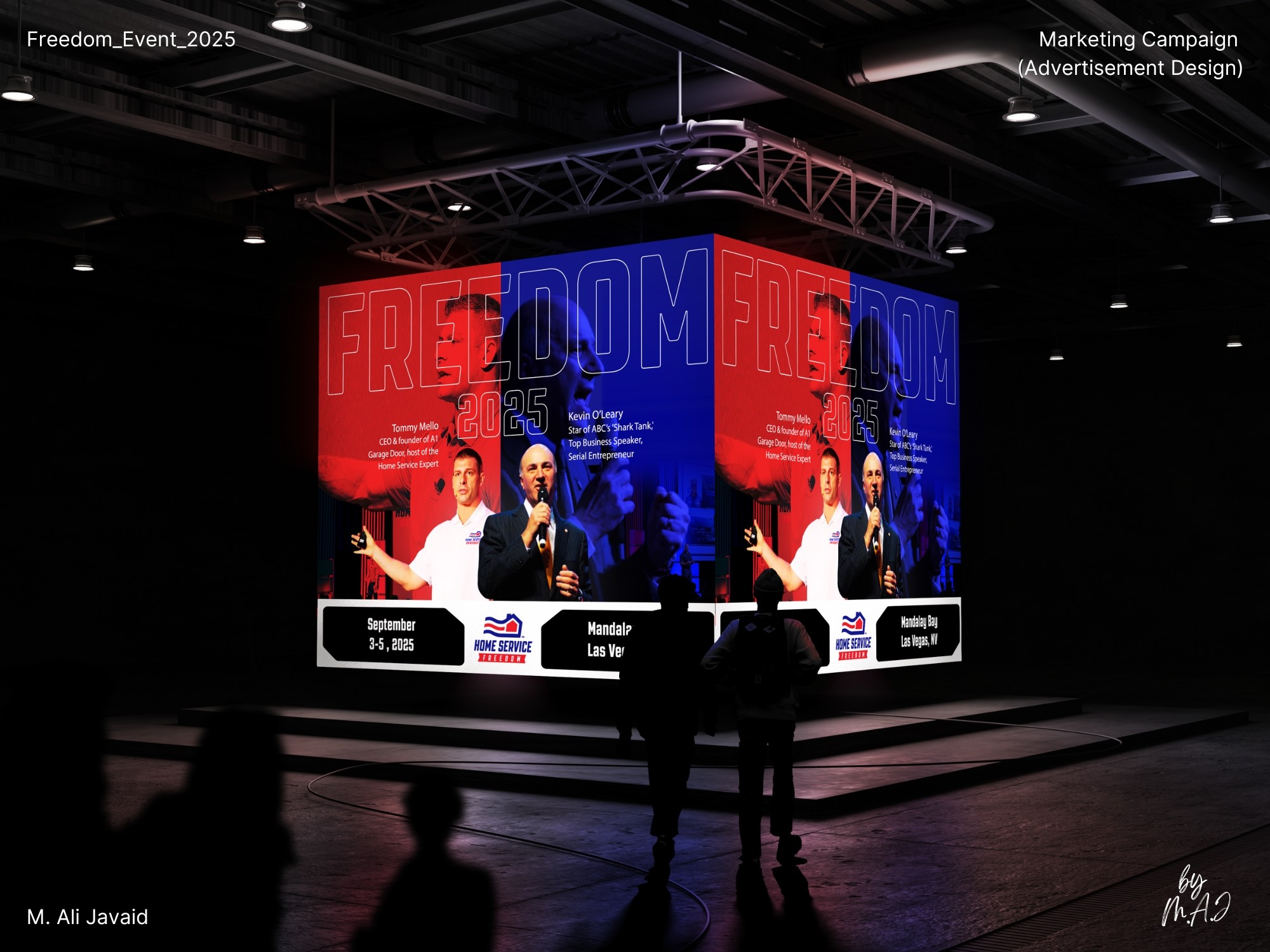
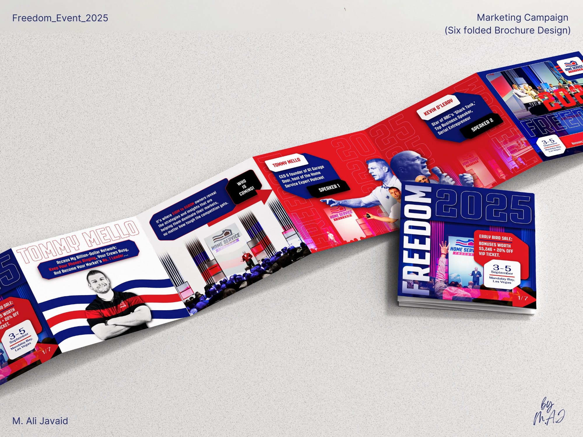
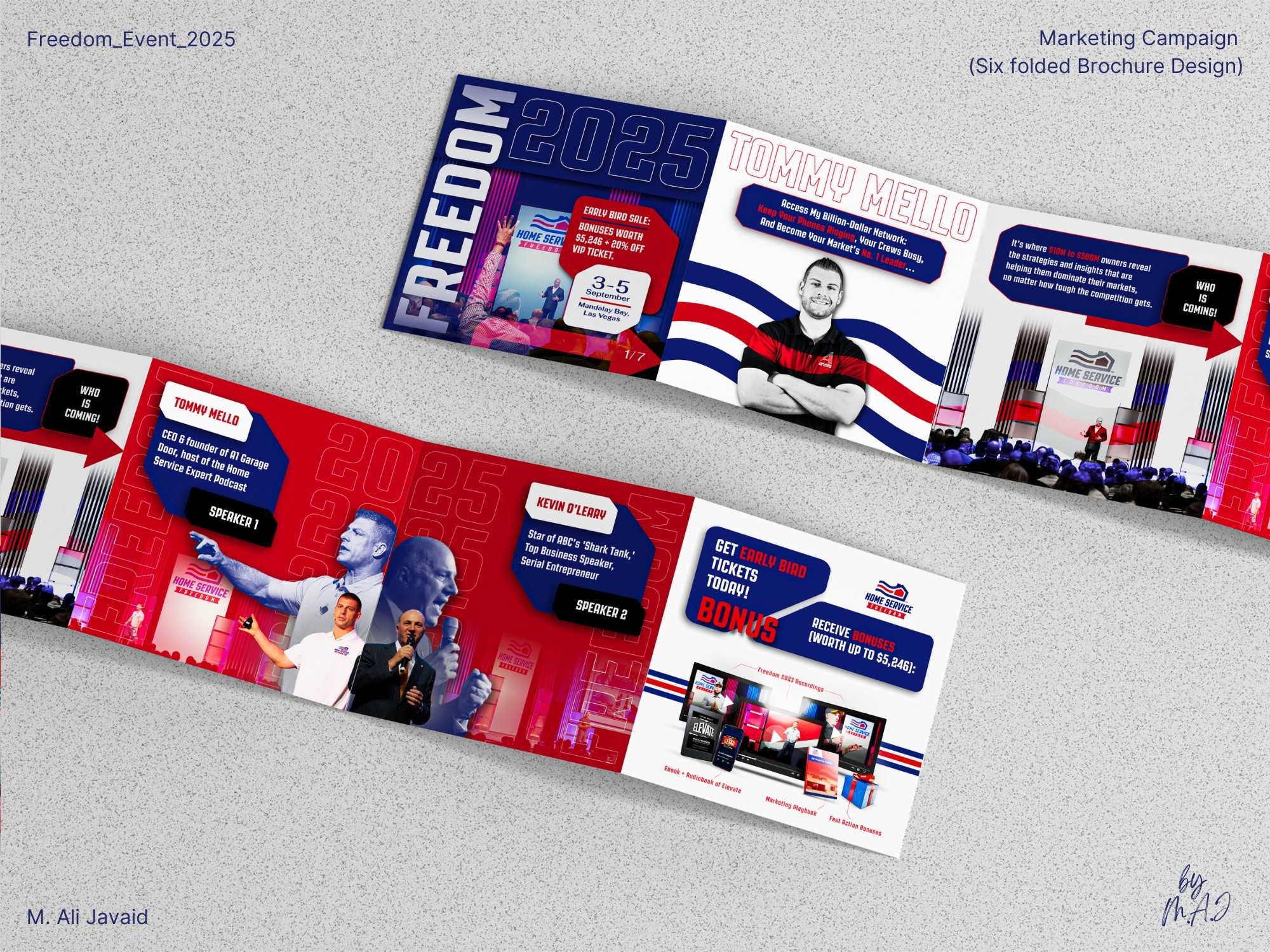
Home Service is gearing up for Freedom Event in Las Vegas, August 2025.

My task was to create promotional materials using the existing brand colors.

With hands-on experience of marketing conference events before, I noticed past Freedom Event promotions all looked the same: clients couldn’t tell difference from each year's event.

The goal was to build a new cohesive visual identity that feels fresh and dynamic across social media, print, and all marketing materials: while still respecting the event’s history.

Solution & impact

Recognizing the event's dynamic and high-energy nature, I drew inspiration from this attendee's comment while searching about the event that goes along “Where champions of the industry collaborate, not for profit: but to teach, inspire, and empower.”

Inspired by the comment and event's high-energy nature: geometric shapes, typography and sporty aesthetics to craft a bold visual identity. By incorporating duotone color schemes, curved angles, and dynamic layouts: the design evokes motion, strength, and clarity. This approach not only reflects the spirit of the event but also distinguishes it from previous years, ensuring a fresh and modern look.

While the project is still ongoing, the initial feedback has been overwhelmingly positive. The new branding direction has generated significant excitement among the team and stakeholders. Although we have yet to measure the full impact, the enthusiastic response indicates a promising shift in how Freedom Event 2025 is perceived.

  • Freedom Event 2025

  • Freedom Event 2025

  • Freedom Event 2025

Logo Agency
Logo Agency

Solution & impact

Recognizing the event's dynamic and high-energy nature, I drew inspiration from this attendee's comment while searching about the event that goes along “Where champions of the industry collaborate, not for profit: but to teach, inspire, and empower.”

Inspired by the comment and event's high-energy nature: geometric shapes, typography and sporty aesthetics to craft a bold visual identity. By incorporating duotone color schemes, curved angles, and dynamic layouts: the design evokes motion, strength, and clarity. This approach not only reflects the spirit of the event but also distinguishes it from previous years, ensuring a fresh and modern look.

While the project is still ongoing, the initial feedback has been overwhelmingly positive. The new branding direction has generated significant excitement among the team and stakeholders. Although we have yet to measure the full impact, the enthusiastic response indicates a promising shift in how Freedom Event 2025 is perceived.

  • Project Gallery

  • Project Gallery

  • Project Gallery

  • Project Gallery

  • Project Gallery

  • Project Gallery

  • Project Gallery

  • Project Gallery

  • Project Gallery

  • Project Gallery

  • Project Gallery

  • Project Gallery

  • Project Gallery

  • Project Gallery

  • Project Gallery

  • Project Gallery

  • Project Gallery

  • Project Gallery

  • Project Gallery

  • Project Gallery

  • Project Gallery

  • Project Gallery

  • Project Gallery

  • Project Gallery

  • Behind the scenes

  • Behind the scenes

  • Behind the scenes

  • Behind the scenes

  • Behind the scenes

  • Behind the scenes

  • Behind the scenes

  • Behind the scenes

  • Behind the scenes

  • Behind the scenes

  • Behind the scenes

  • Behind the scenes

"BRANDING THE ADRENALINE" OF FREEDOM EVENT 2025

"BRANDING THE ADRENALINE" OF FREEDOM EVENT 2025

Impact

• Created a distinct visual identity that breaks the pattern of previous years’ designs.

• Stakeholder response was 3× more positive than previous Freedom Event campaigns.

Creative Thinking

• While researching event branding, I read "Jason Wyman’s article on Sans Serif", which explains how repeating the same conference visuals each year dulls audience energy. I shared this insight with stakeholders, who agreed a fresh approach was overdue.

One comment online described the Freedom Event as a space “where champions of the industry collaborate: not for profit, but to teach, inspire, and empower.” That line pushed me to design a bold, high-energy identity: using only existing brand colors, and building a sporty visual language from scratch (no proper guidelines).

• I used duotone palettes and curved, angled elements to evoke motion, urgency, and adrenaline: mirroring the high-stakes tone of the event without losing clarity.

Bold sans-serif type and tight hierarchy gave structure to the visual noise: keeping things readable across print, digital, and outdoor formats.

Project Highlights

• Created a fresh visual identity using only existing brand colors (no branding guidelines)

• Shaped high-energy, sports-inspired visuals based on real attendee insights/experience.

• Designed with consistent visual identity across print, social, and outdoor formats.

• Advocated for changing yearly conference visuals: backed by design research on visual fatigue and brand freshness by "Jason Wyman’s article on Sans Serif."

  • Thanks for watching

Got a new project to discuss

  • Thanks for watching

Got a new project to discuss

  • Thanks for watching

Got a new project to discuss

  • Behind the scenes

  • Behind the scenes

  • Behind the scenes

  • Behind the scenes

  • Behind the scenes

  • Behind the scenes

  • Behind the scenes

  • Behind the scenes

  • Behind the scenes

  • Behind the scenes

  • Behind the scenes

  • Behind the scenes

Create a free website with Framer, the website builder loved by startups, designers and agencies.