Client
Software used
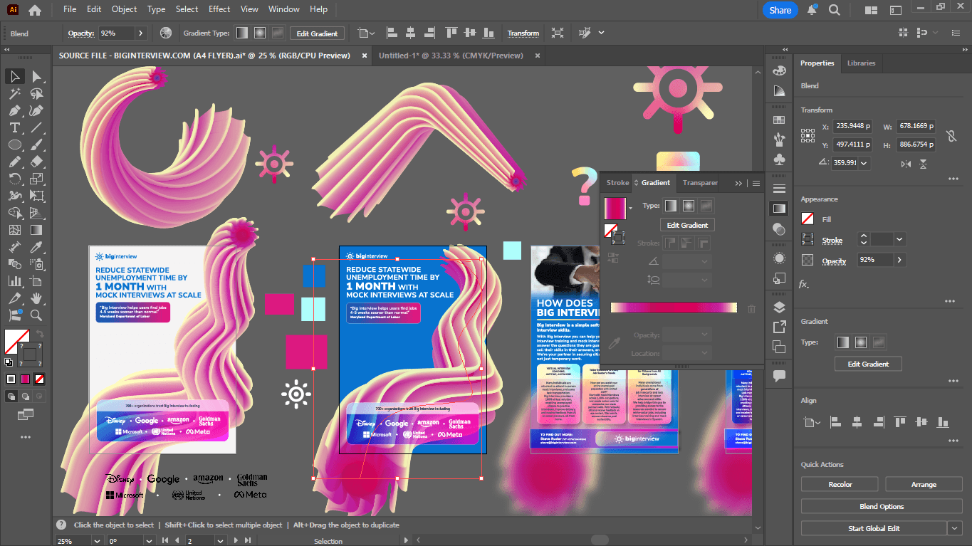
Adobe Illustrator
Services
Visual Identity | Print Design | Marketing Assets
Website
Problem & Goal
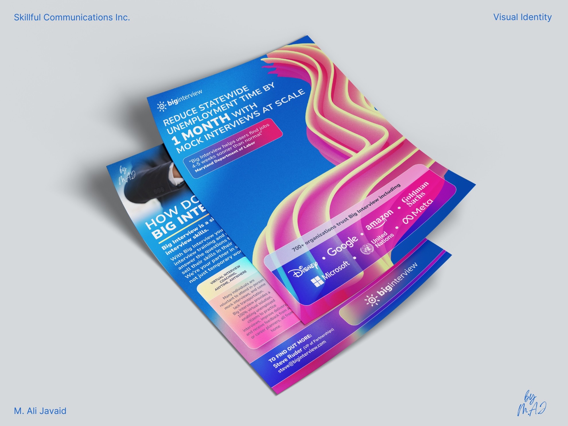
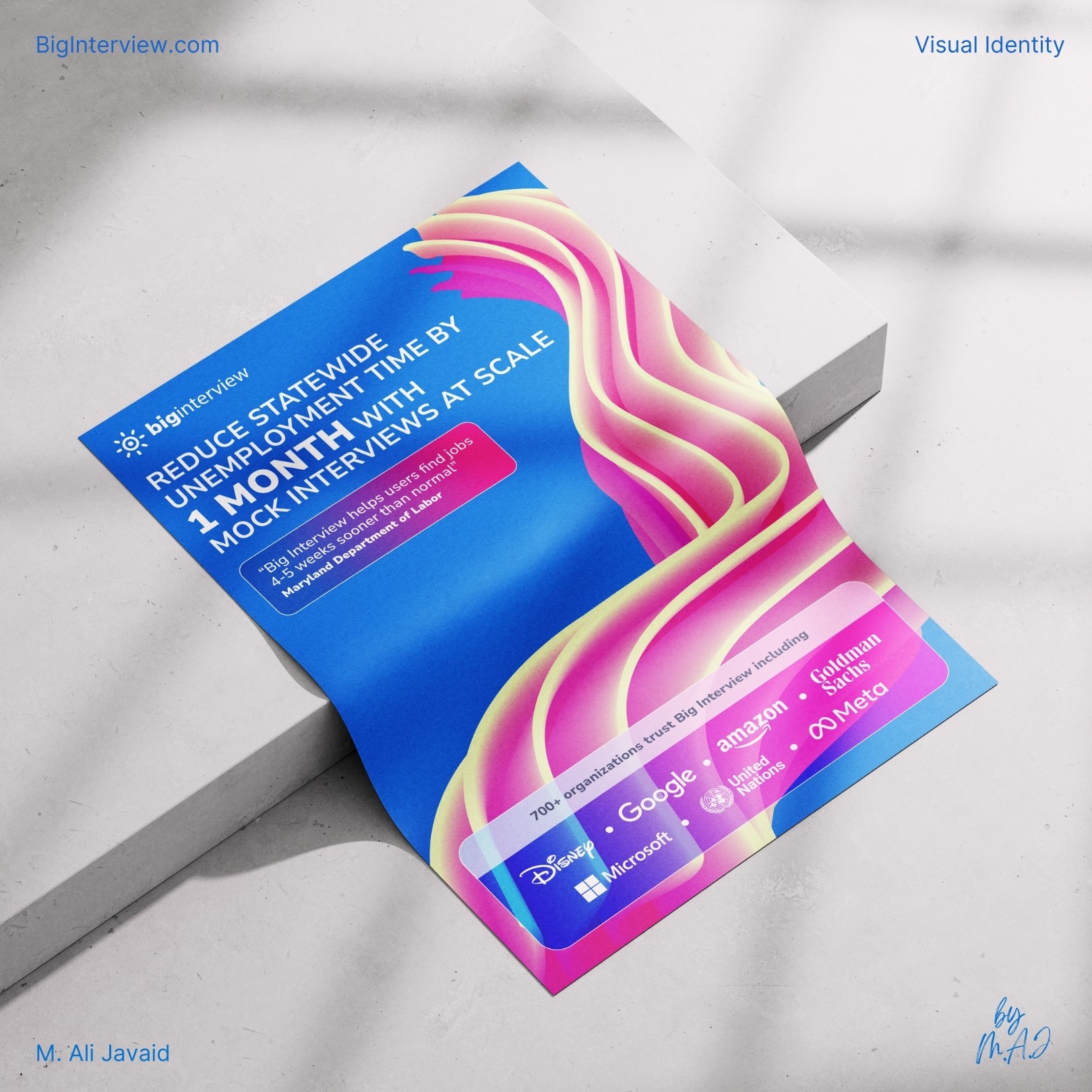
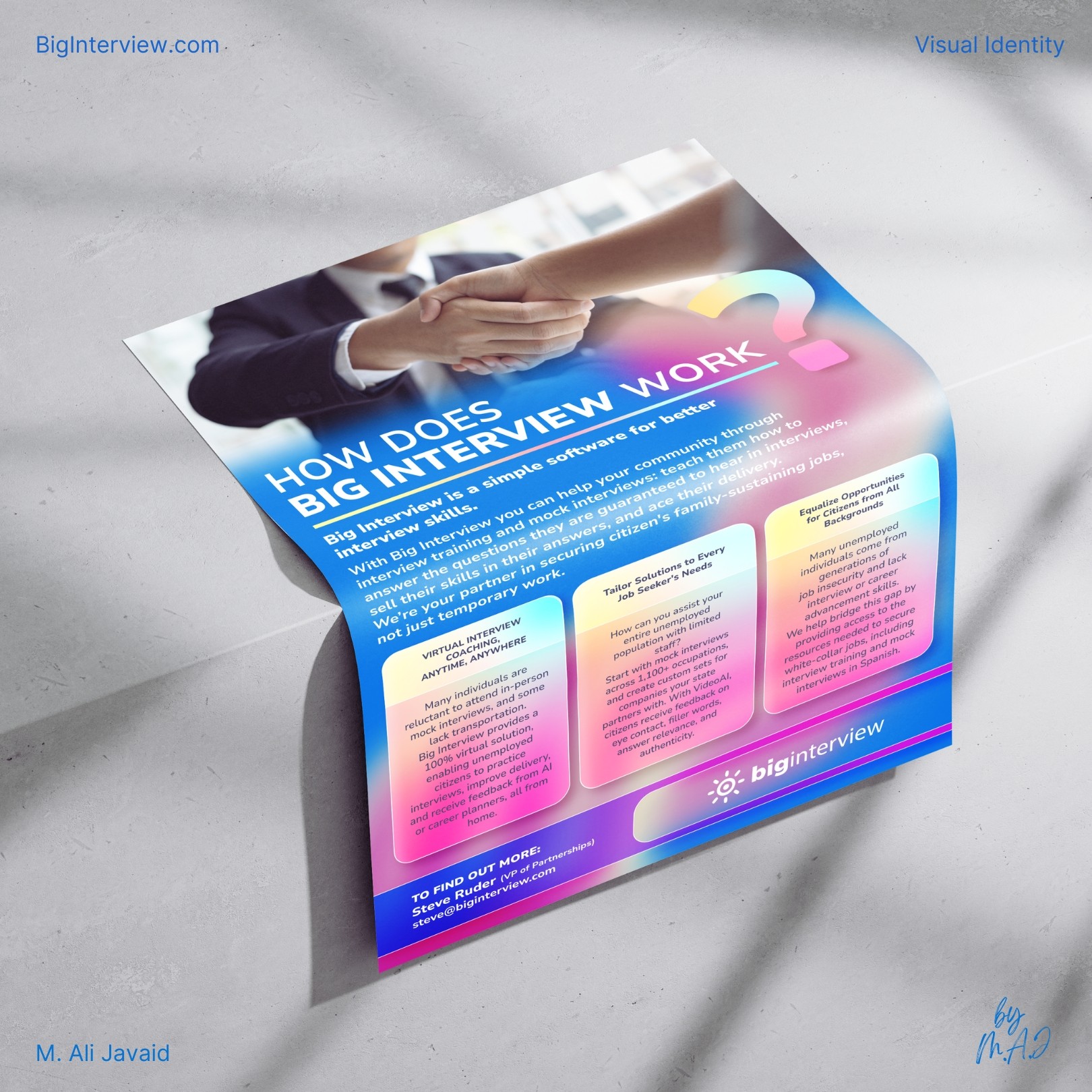
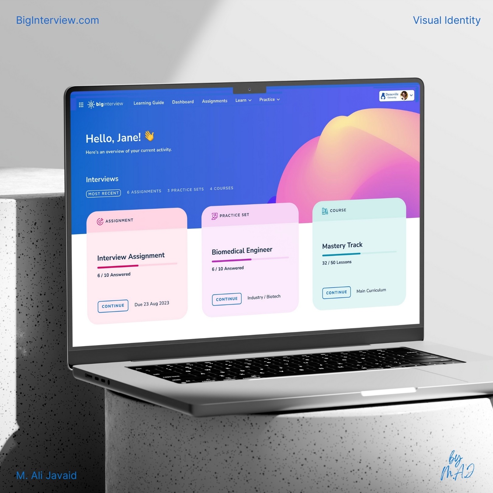
Turning one screenshot into a complete rebrand? Challenge accepted!
The goal was to test rebranding for a "job interview preparation SaaS-based service called BigInterview." It started with print design for conference distribution, ensuring a professional yet approachable identity.
The client’s message was clear: "Fun with colors, corporate yet not too corporate serious."

Impact
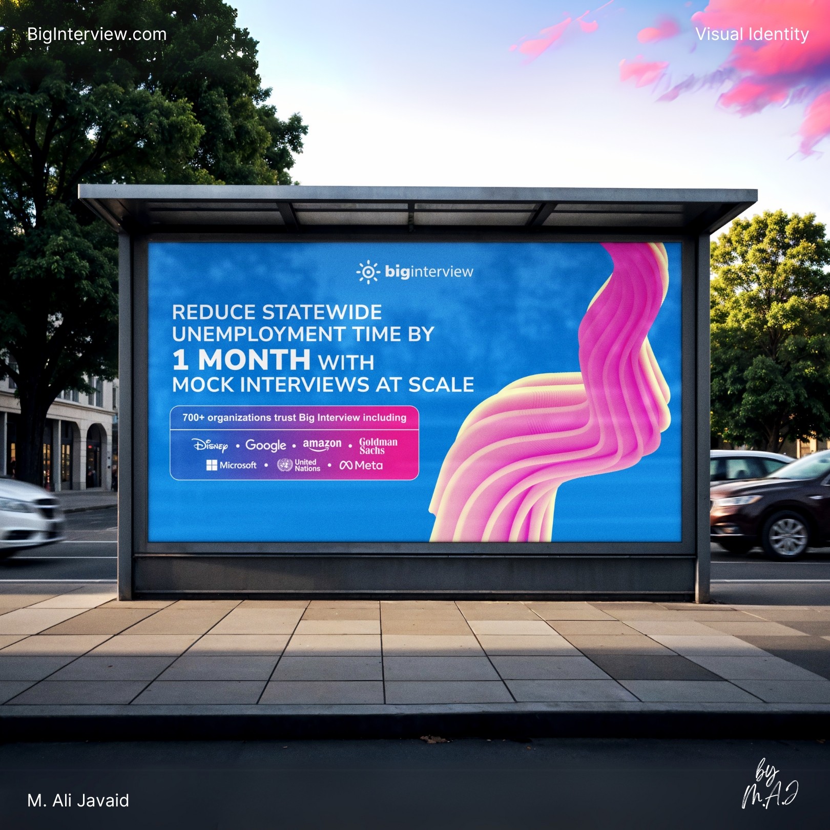
• 45% increase in booth traffic and new sponsorship leads after launching the rebrand at industry conferences.
• 25% boost in email subscriber retention driven by consistent, branded email and landing page design.
Creative Thinking
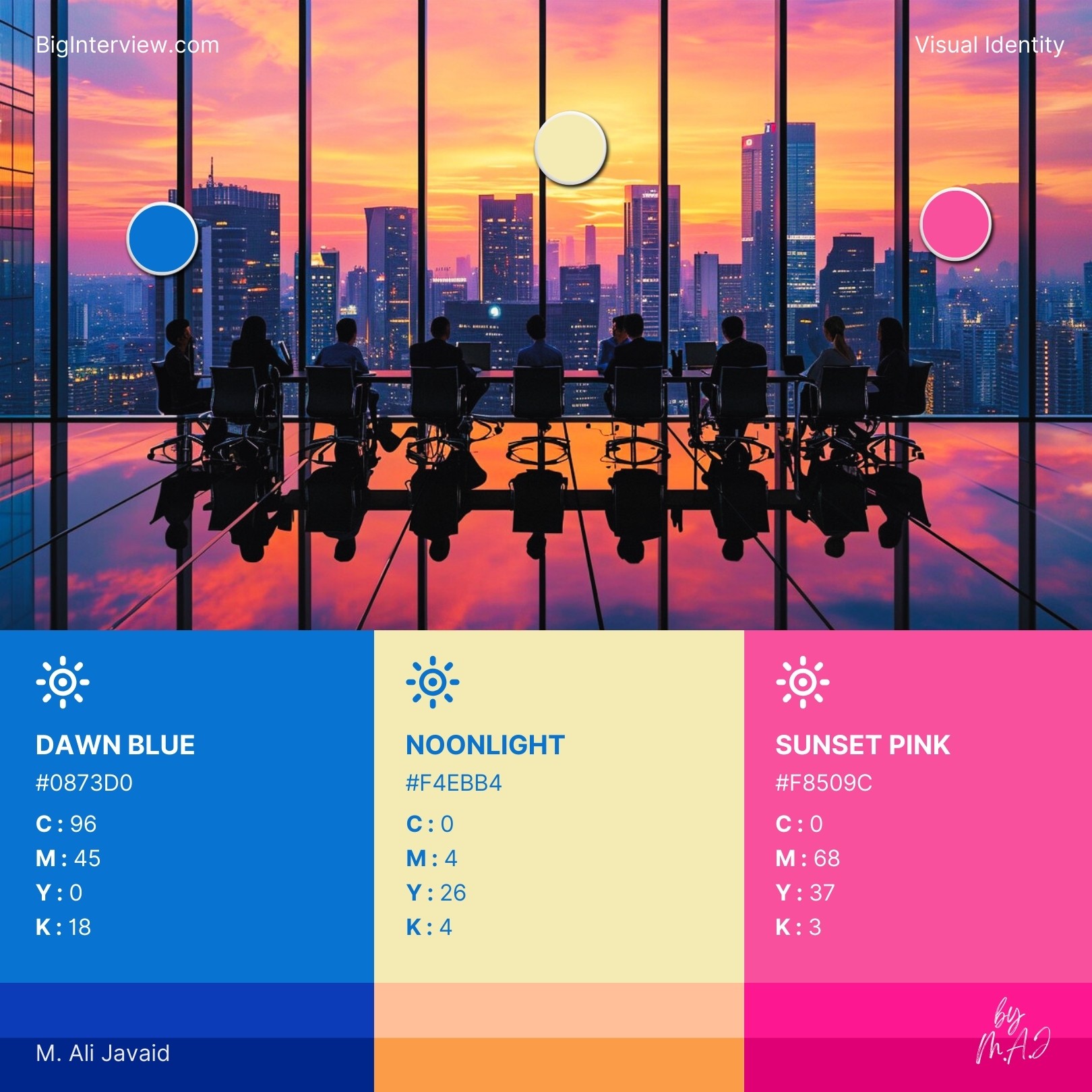
• Drew inspiration from the sun-shaped logo to create a dynamic color palette that flows from warm sunrise tones to calm sunset hues: symbolizing a full, productive workday and visually reinforcing the brand’s connection to daily growth and progress.
• Translated the client’s vision of “corporate, but not too corporate” into a balanced visual style: using structured layouts for professionalism and vibrant colors for a friendly, approachable feel.
• Designed custom 3D brand elements in Adobe Illustrator to add depth, energy, and visual consistency across print and digital assets.
Project Highlights
• Rebranded "BigInterview" from a single screenshot.
• Built a color system inspired by the sun shaped logo and 9–5 workflow.
• Designed custom 3D elements and modular layouts in Adobe Illustrator.
• Delivered print materials that boosted booth traffic by 45%.
• Extended visuals to landing page UI and email design to ensure consistency.
